Client
Mahta
Services
Branding
Editorial Design
Illustrations
Packaging
Webdesign
Regenerative nutrition from the Amazon Forest.
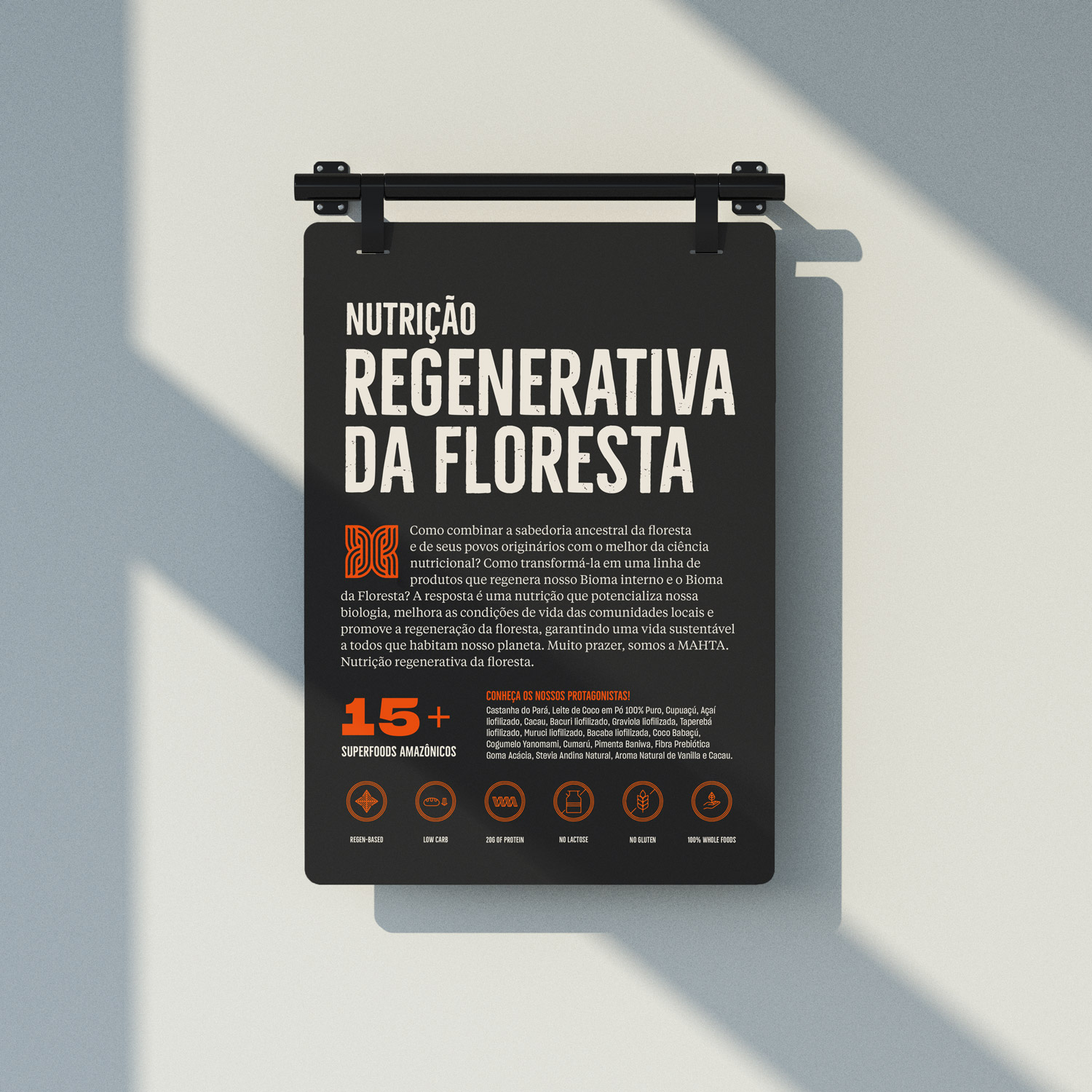
Mahta combines modern nutritional science with the ancestral knowledge of the guardians of the Amazon Rainforest, through plant-based superfoods that promote the regeneration of forests and help in the regeneration of the microbiome.
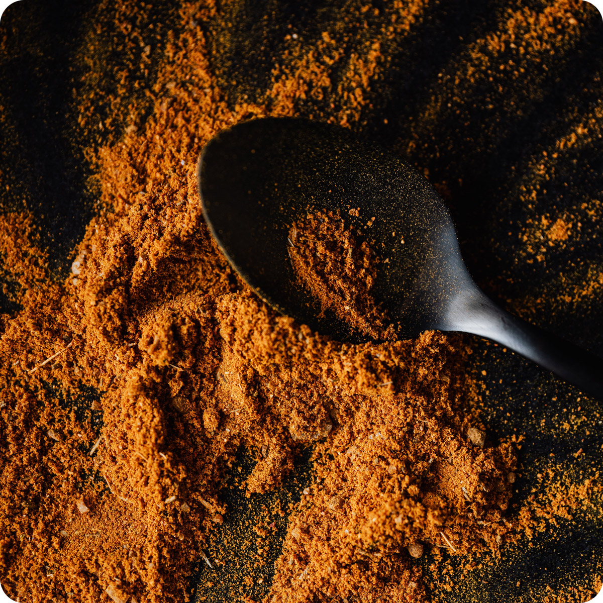
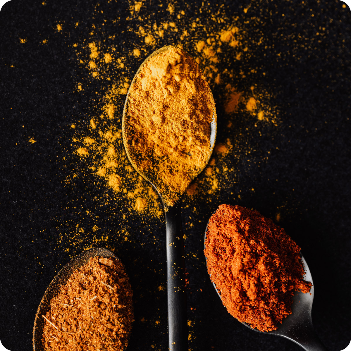
The superfoods are exclusively supplied by extractivists and/or small agroforestry producers, who follow the rhythm of the forests and their cyclical, symbiotic nature where the nutrient exchange is dense, rich, and permanent. It is pure, natural, organic, 100% whole food in powder form.
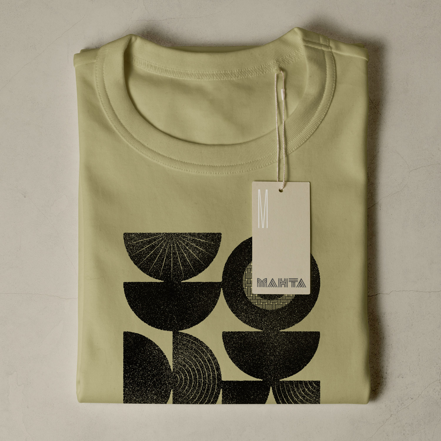
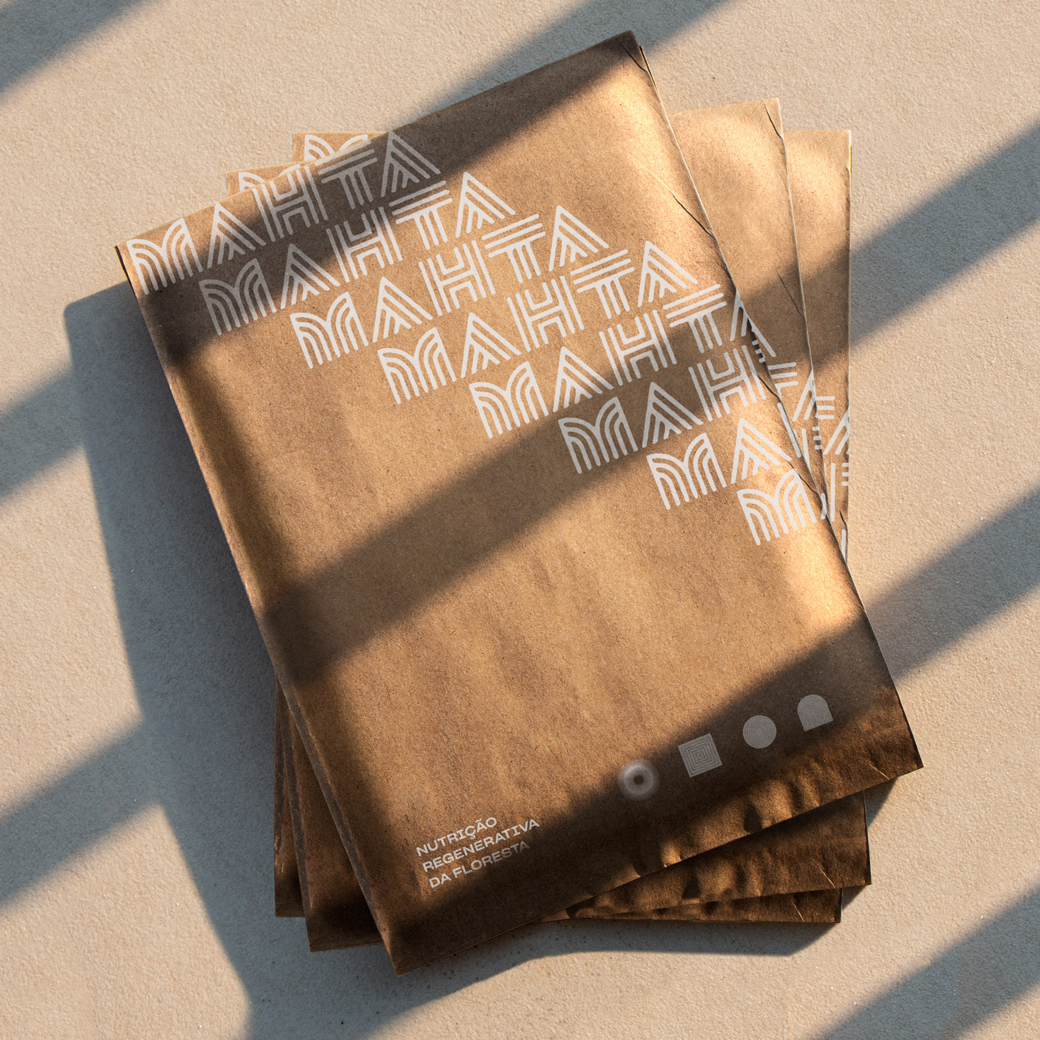
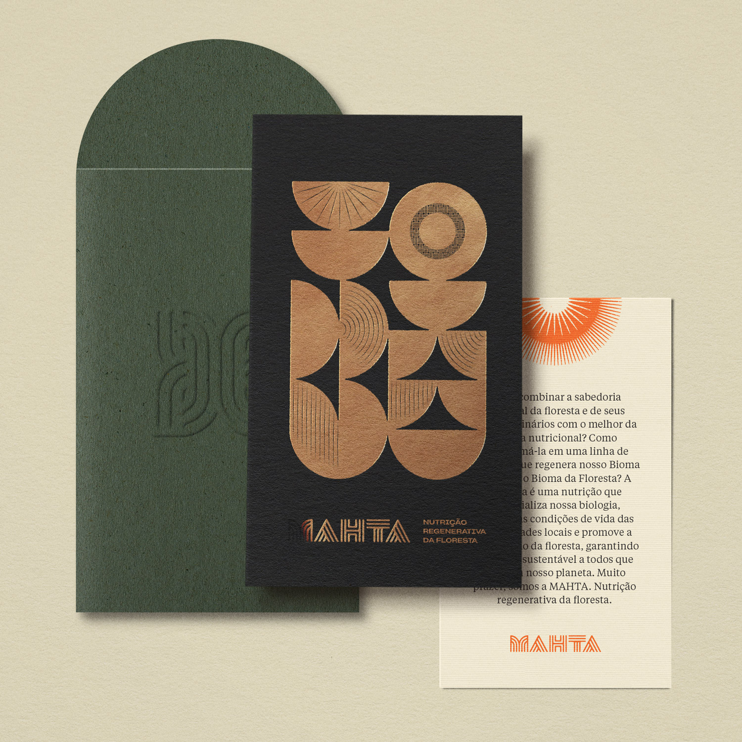
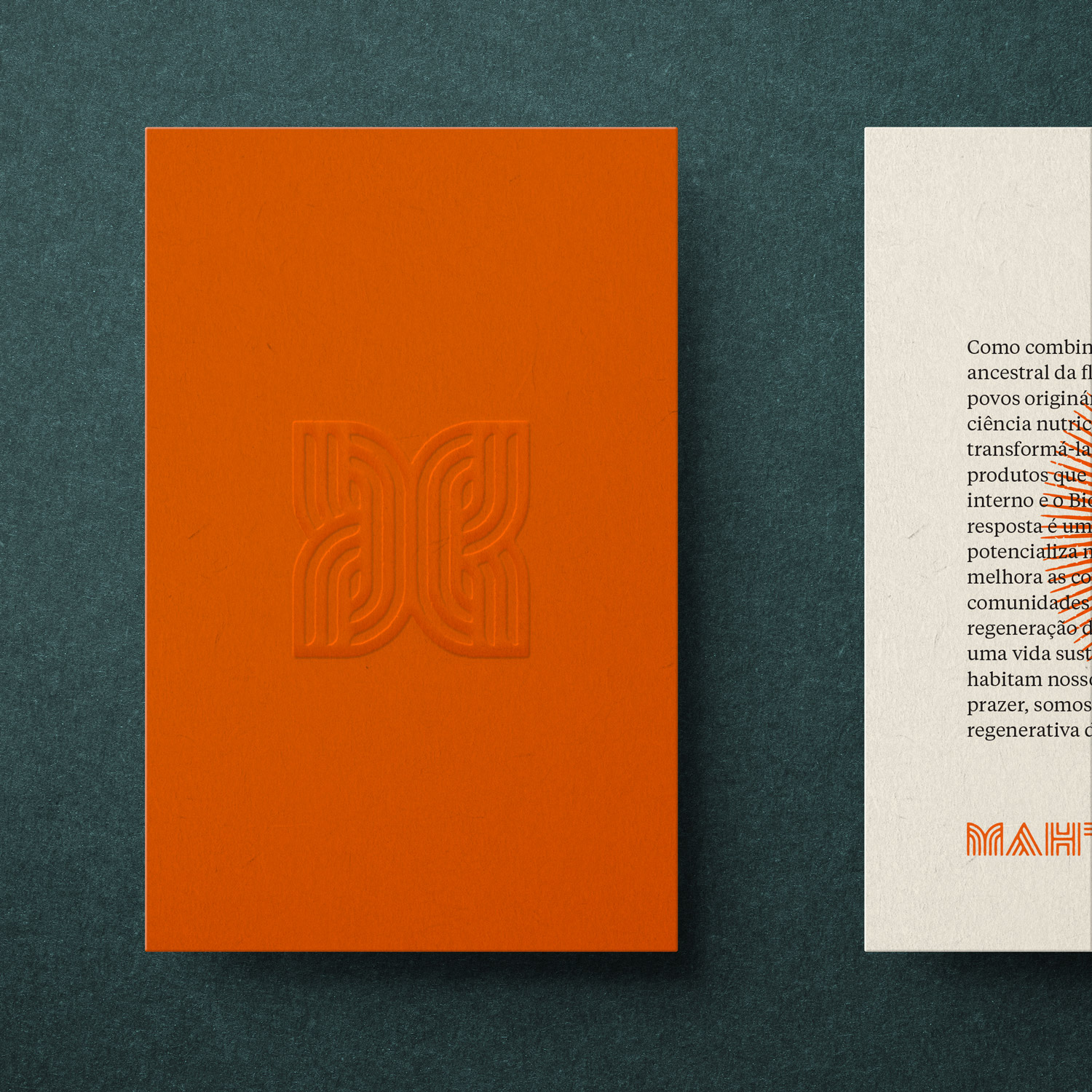
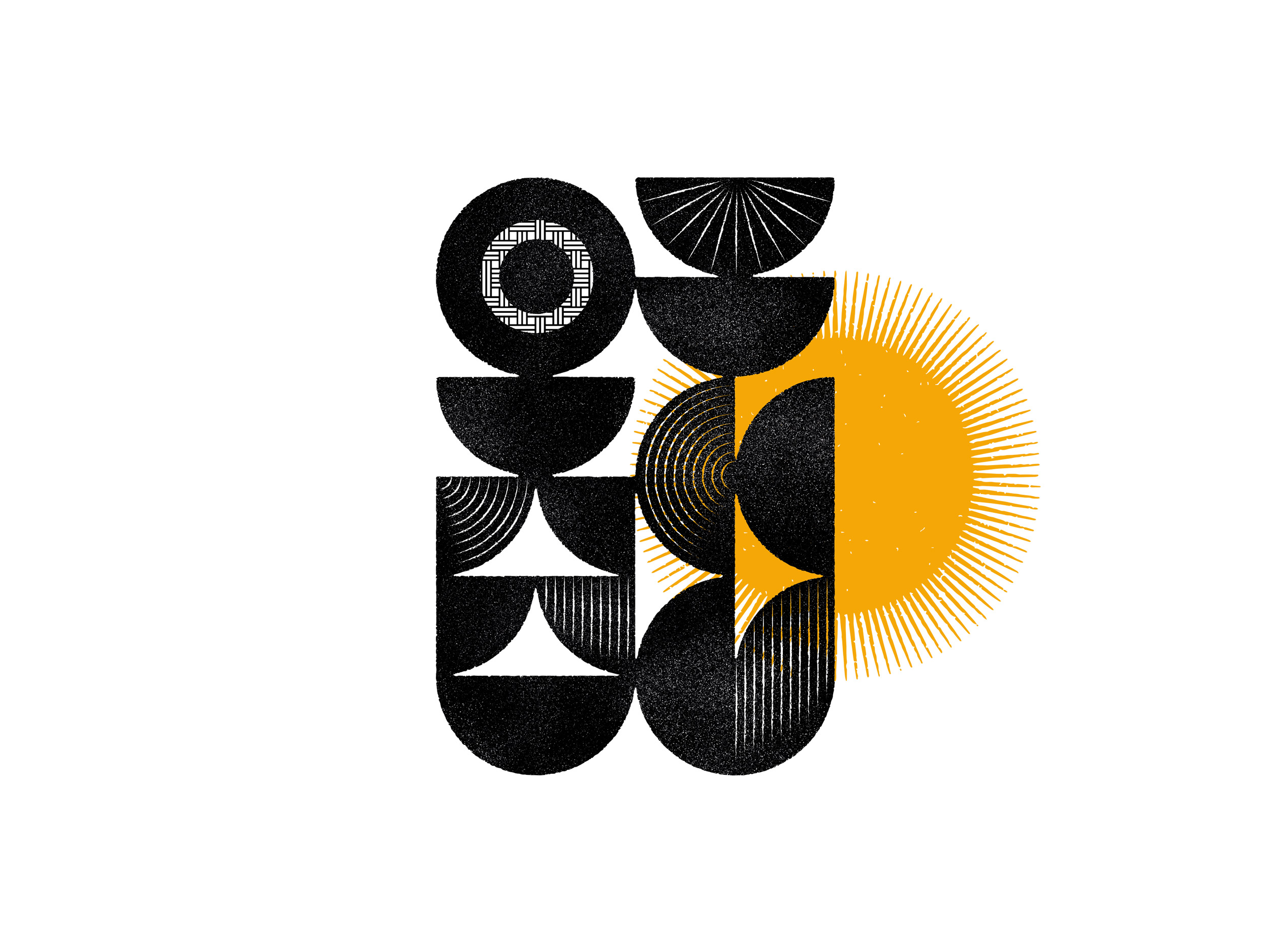
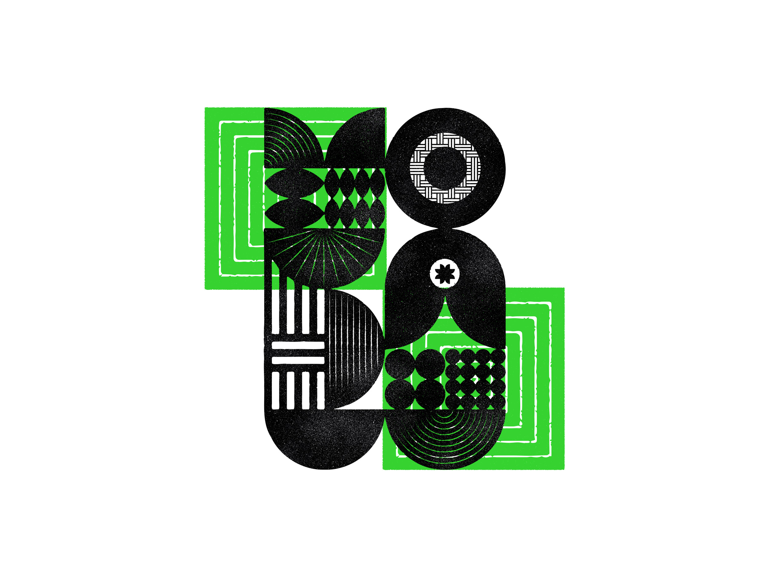
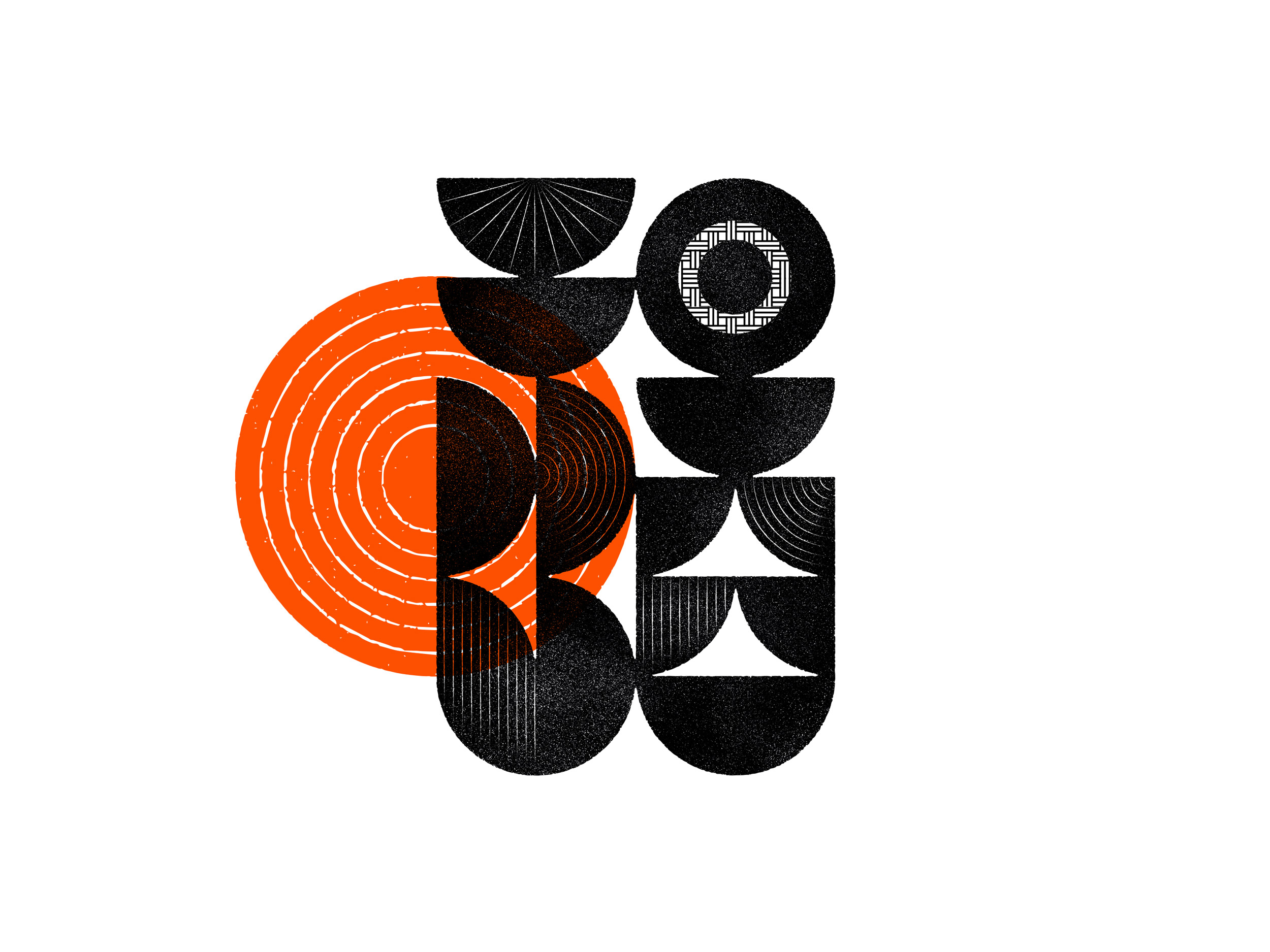
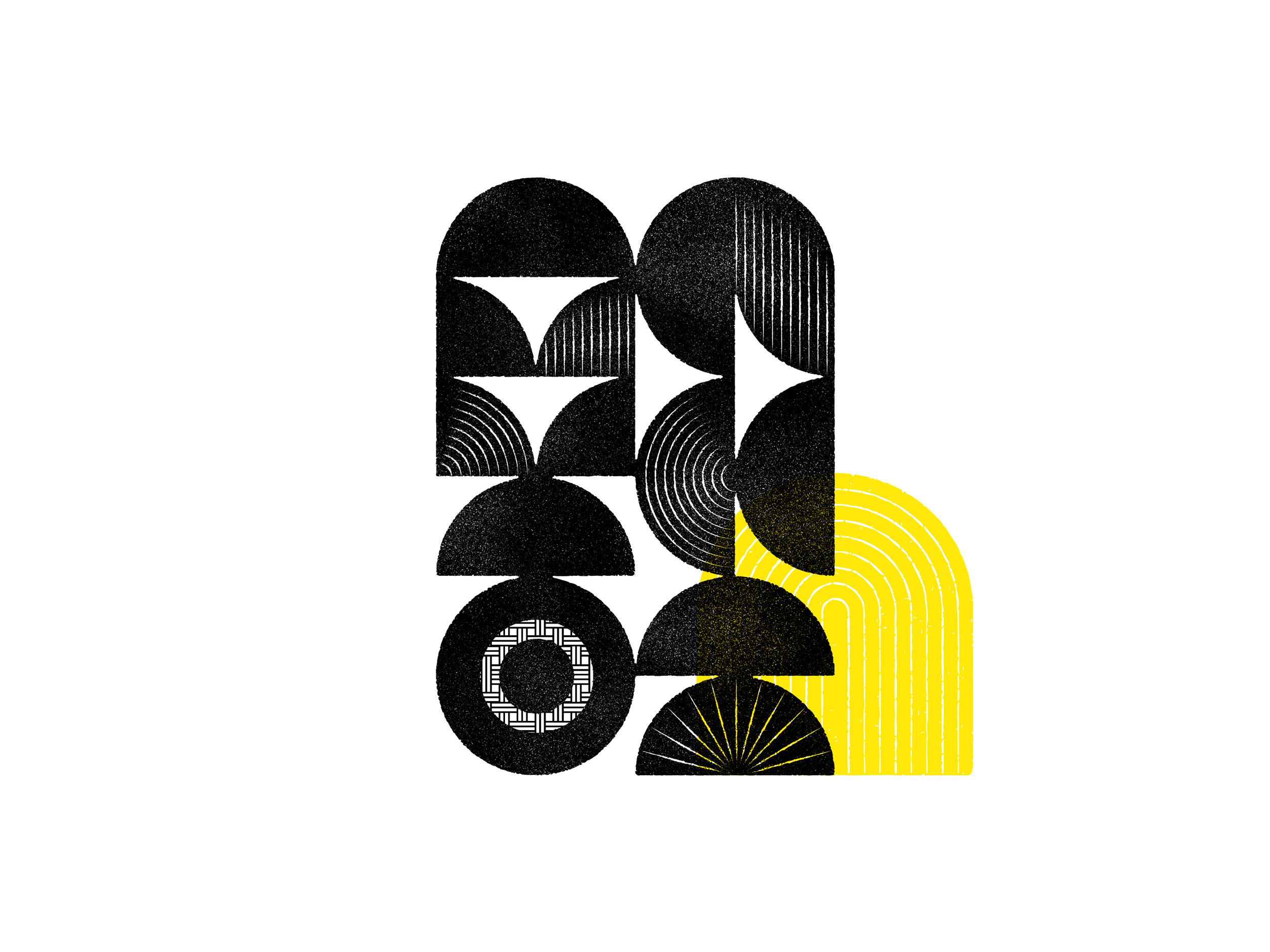
The visual approach was based on Brazilian indigenous iconography, in particular on the identity graphics of tribes from the Amazon region, such as the Karajá, the Baniwa, and the Munduruku. The vernacular wordmark condenses geometric-manual lines into bold characters full of symbolism, which serve as the foundation for the brand's entire visual system.
Wordmark

Mark

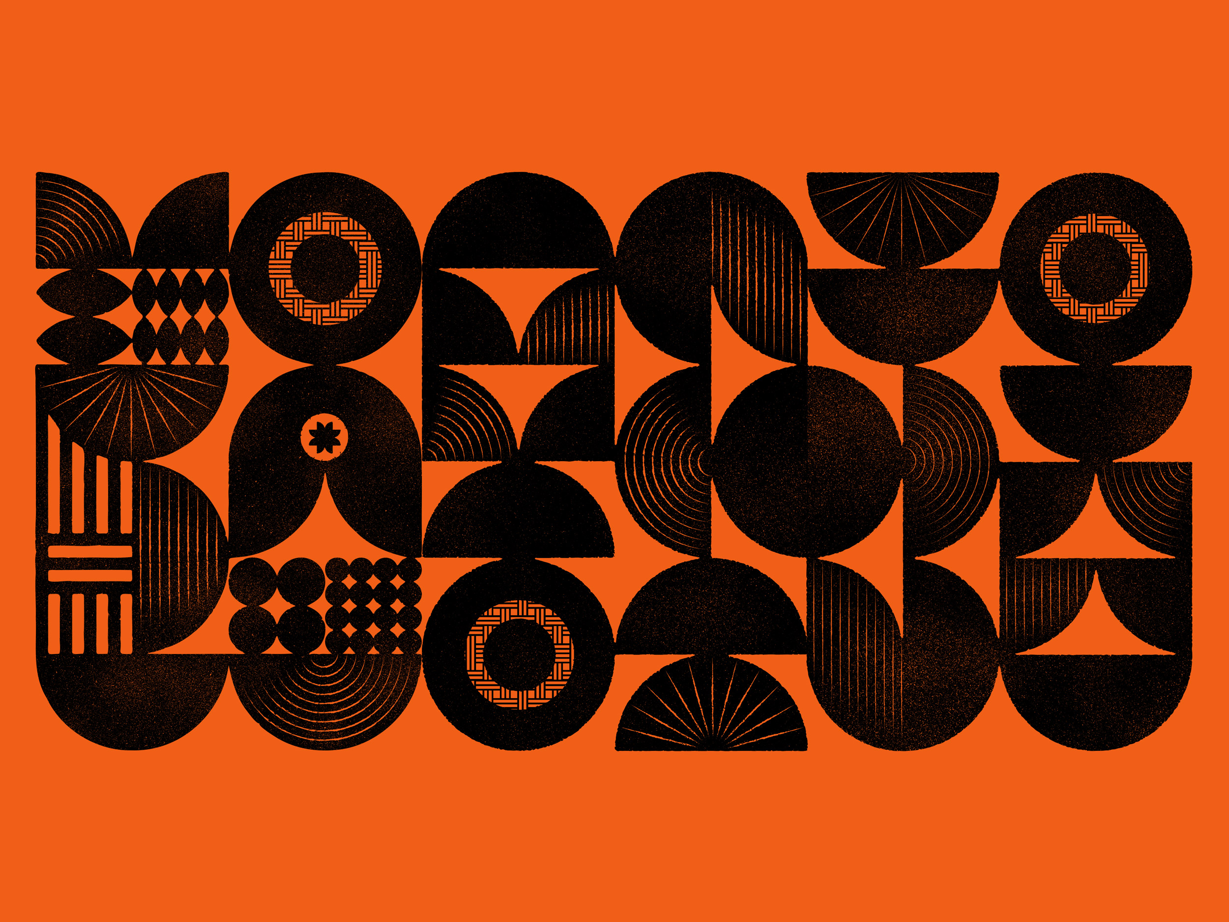
Illustration language
How can we give new meaning to the iconography of the indigenous people and their environmental context in the light of an expression that recognizes their ancestral knowledge and elevates them to an evolutionary, innovative level expanding the brand's potential for a meaningful dialogue with society?
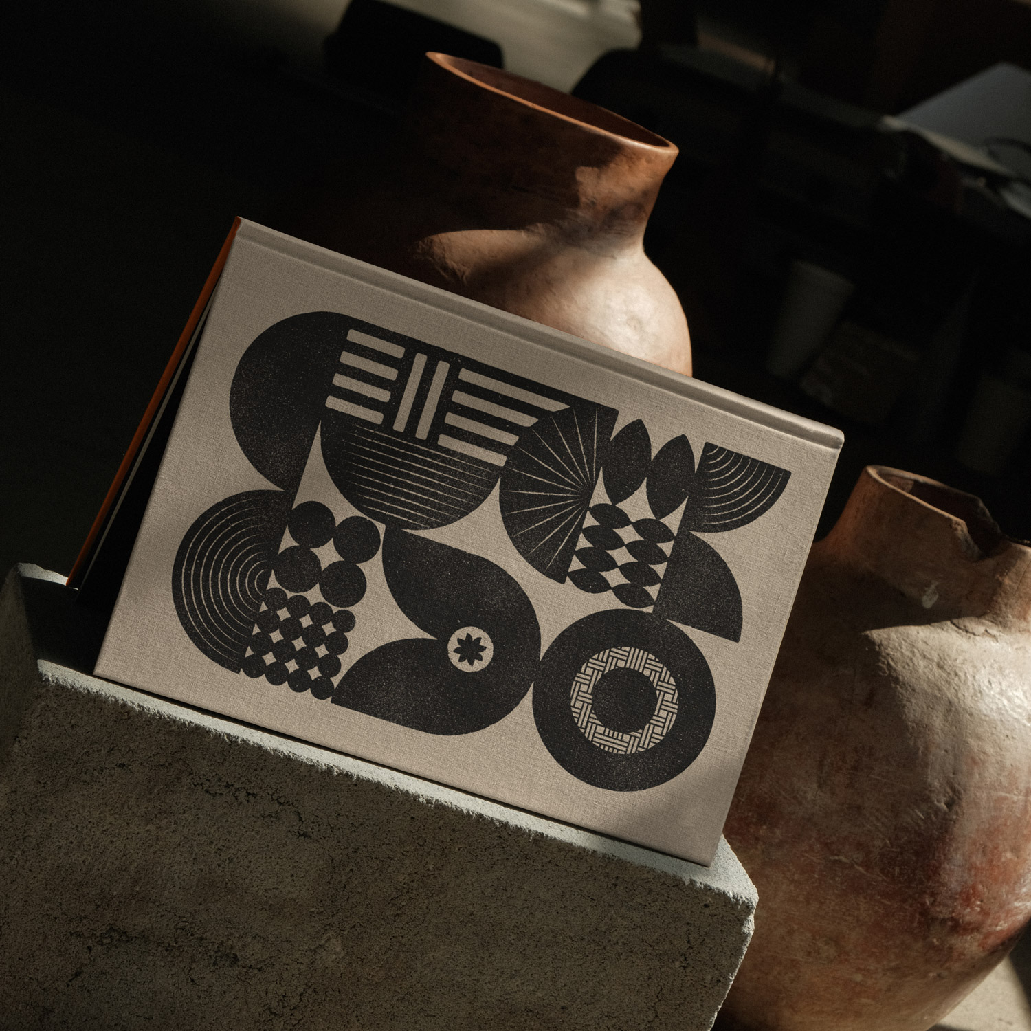
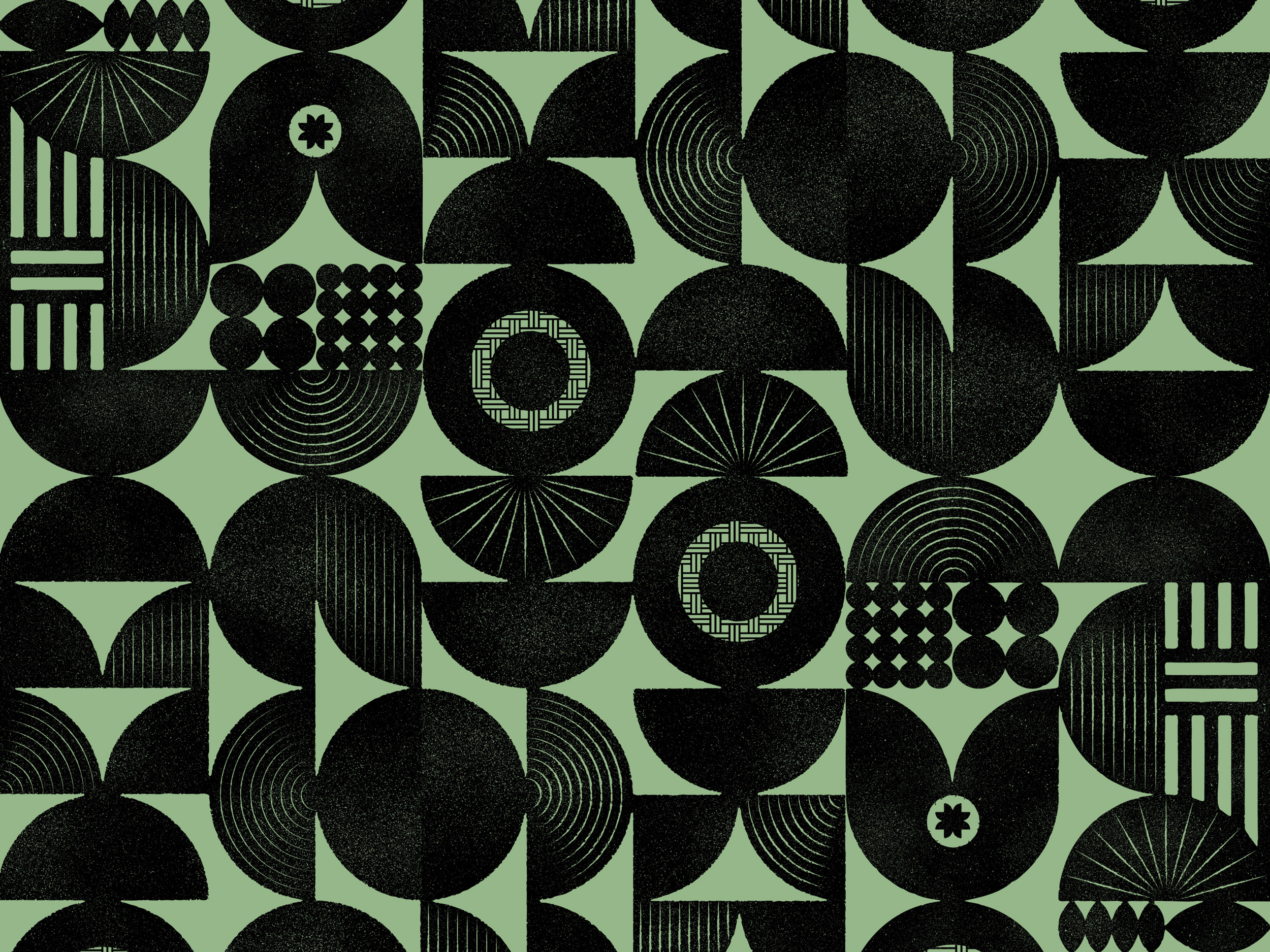
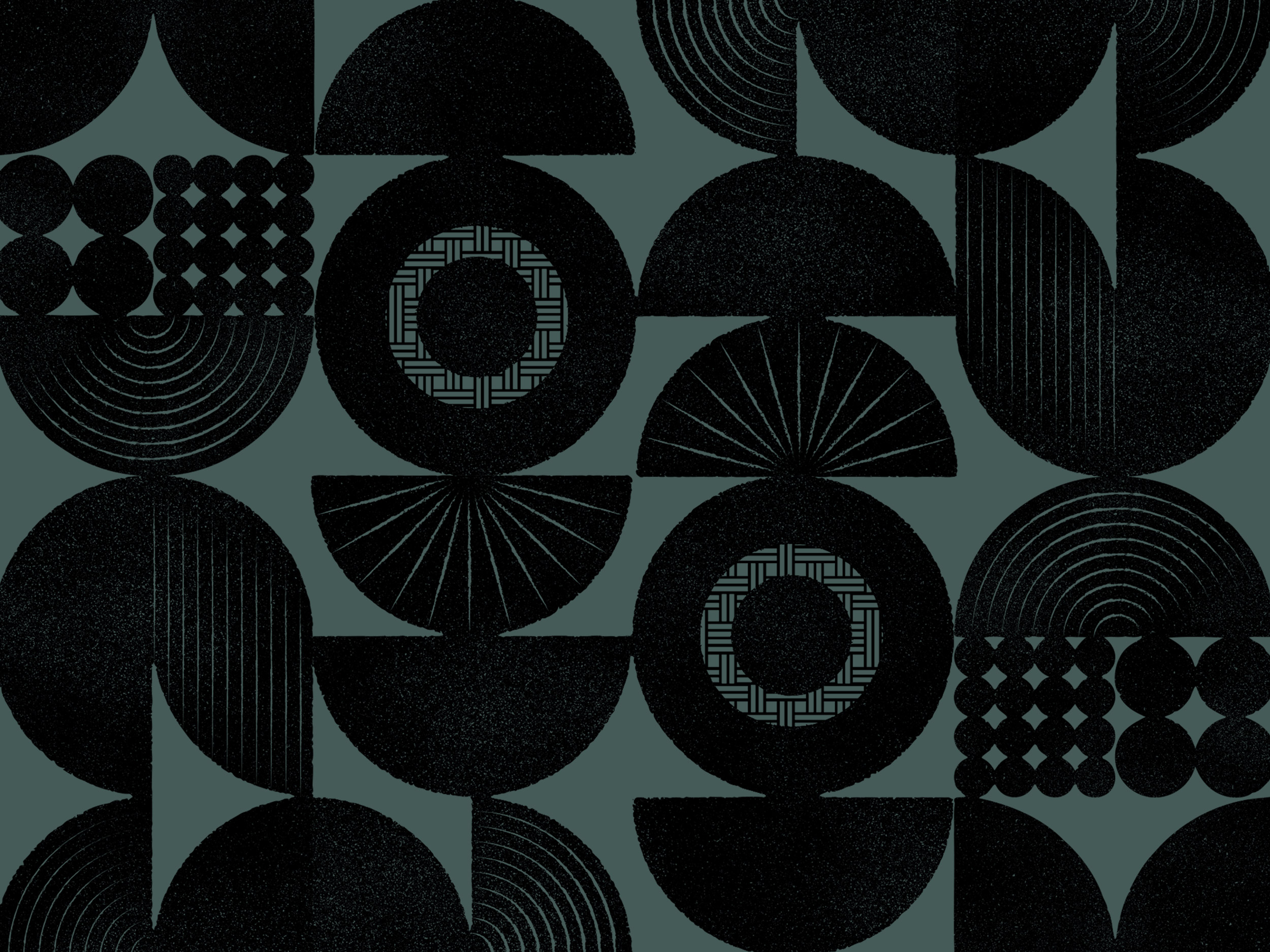
Starting from the inherent simplicity and beauty of their symbology, we generated different geometric structures based on a single module, representing the gourd, one of the most ancient artifacts of humanity. Through various combinations of patterns and compositions — whose shapes refer to figures present in the lexicon of the forest and the culture of native peoples, such as leaves, flowers, birds, seeds, gourds, and stars, — and the high contrast between the filled and empty spaces, the illustrations reinforce aspects like strength, balance, fluidity, and diversity while preserving its simplicity.

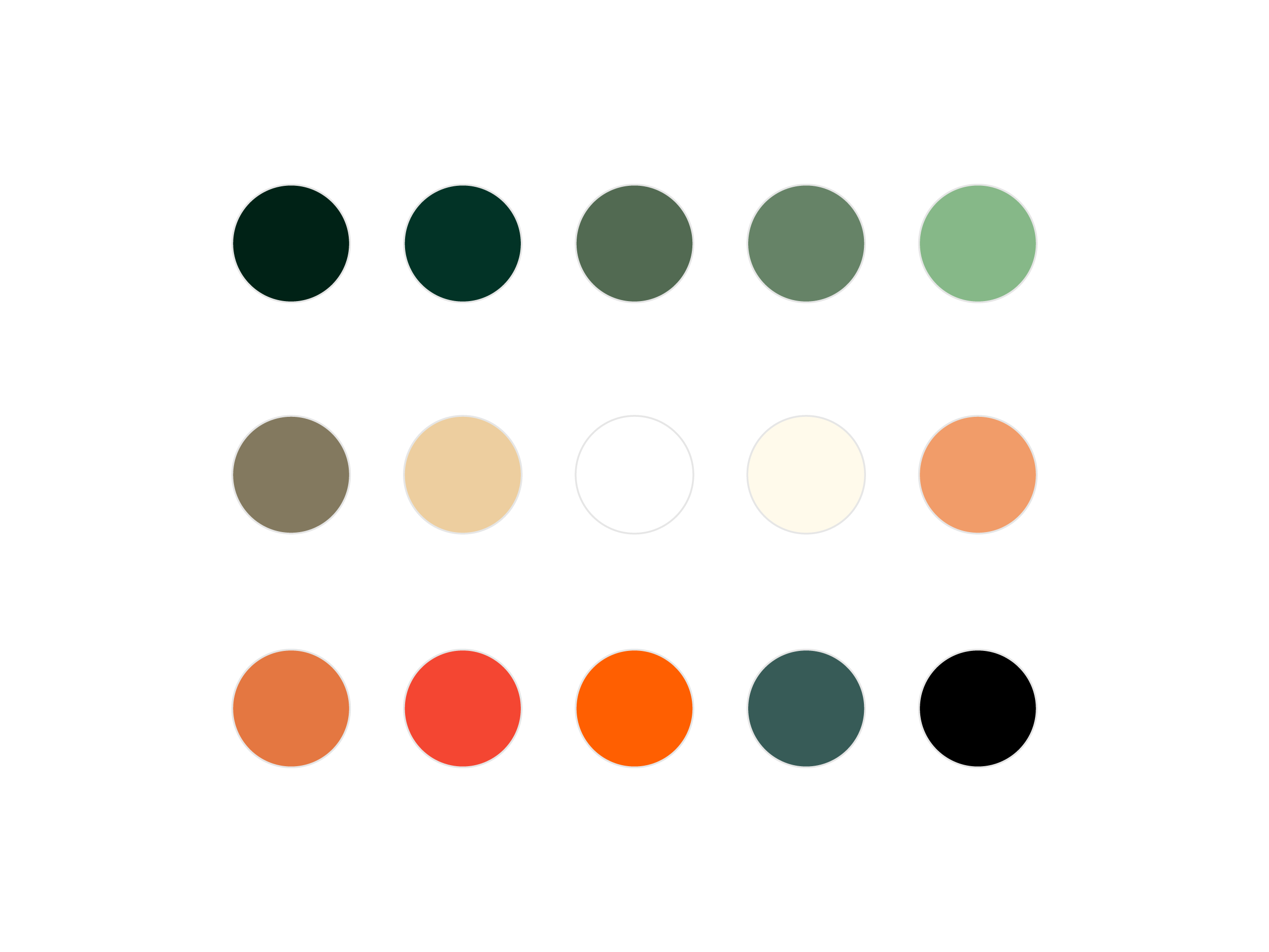
Colors
Icons
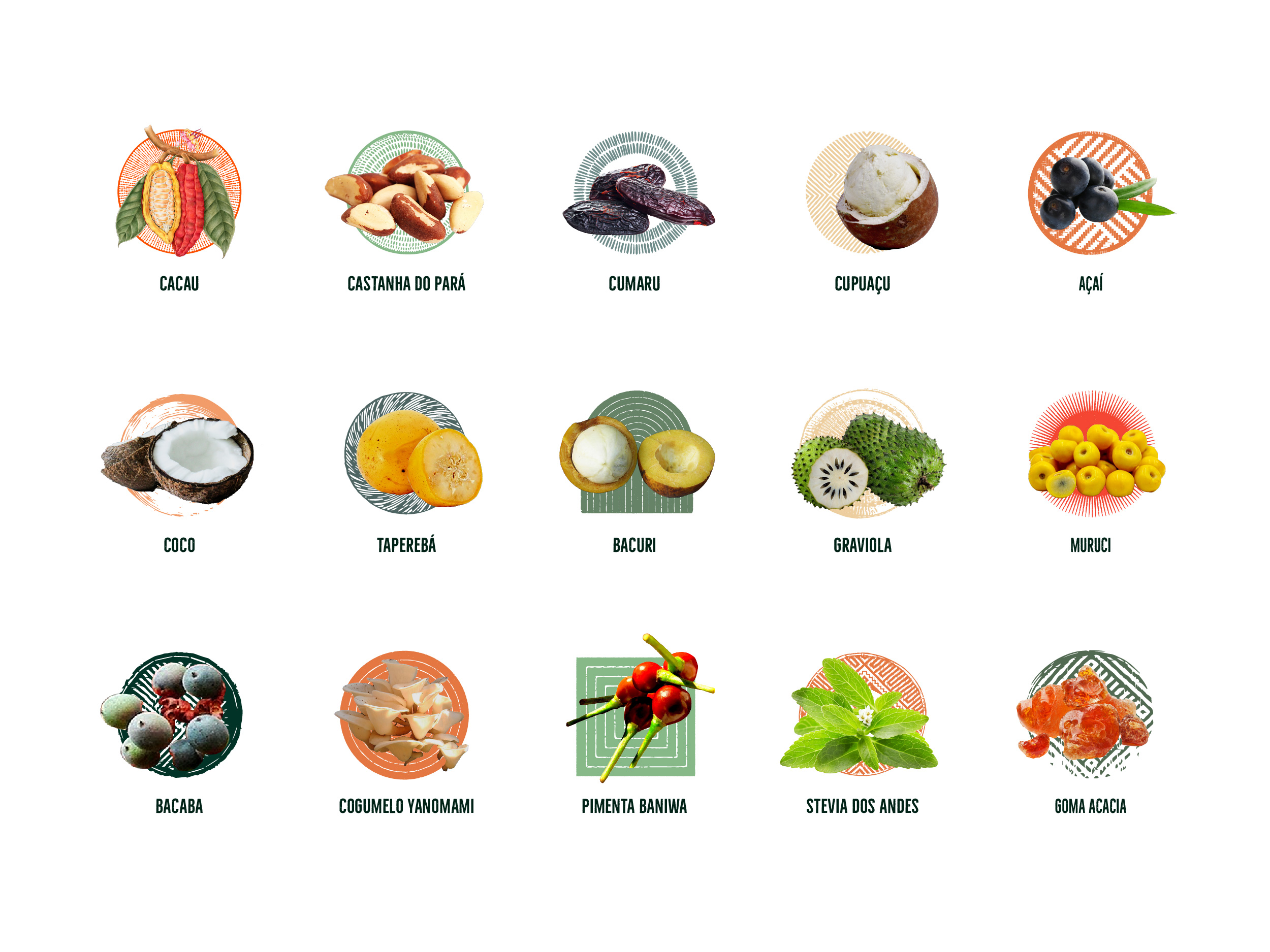
Ingredients
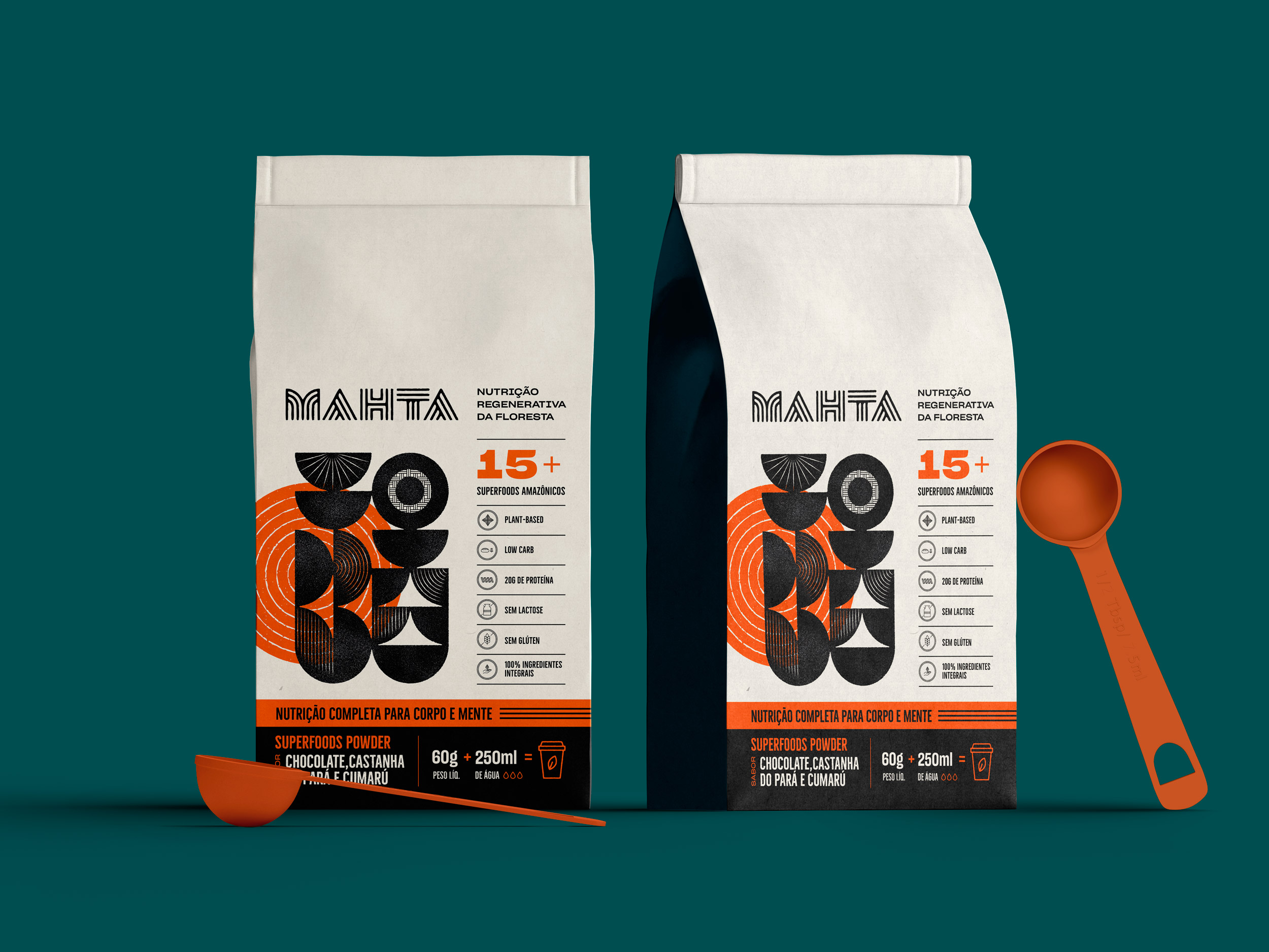
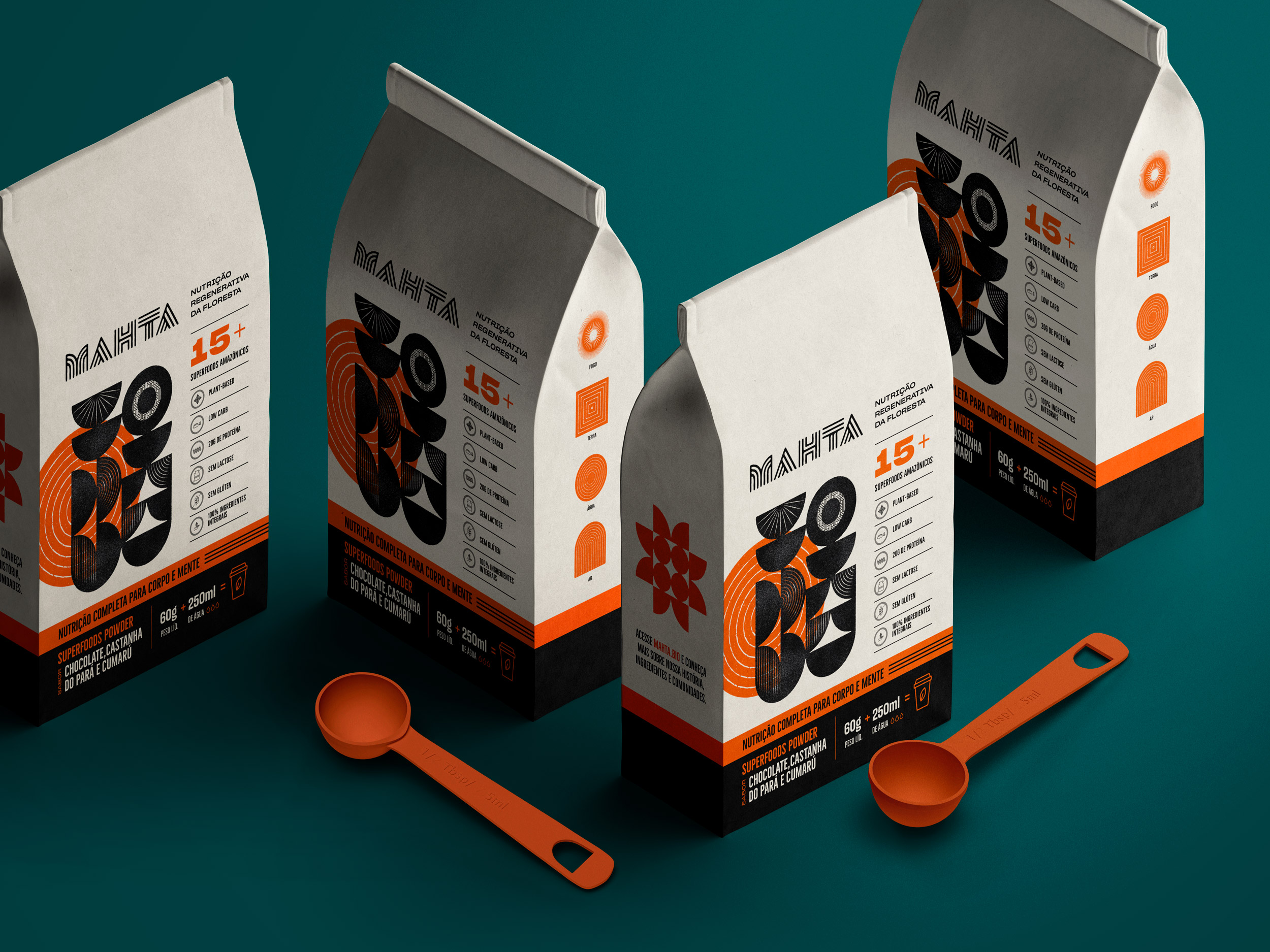
Packaging concept
Branding, Information Design, Packaging Design, Illustrations: Fabio Issao
Year: 2021 — 2022
© 2024 Fabio Issao. 山本功

