

Client
Wichita State University
W. Frank Barton School of Business
Services
Branding
Brand Strategy
Information Design
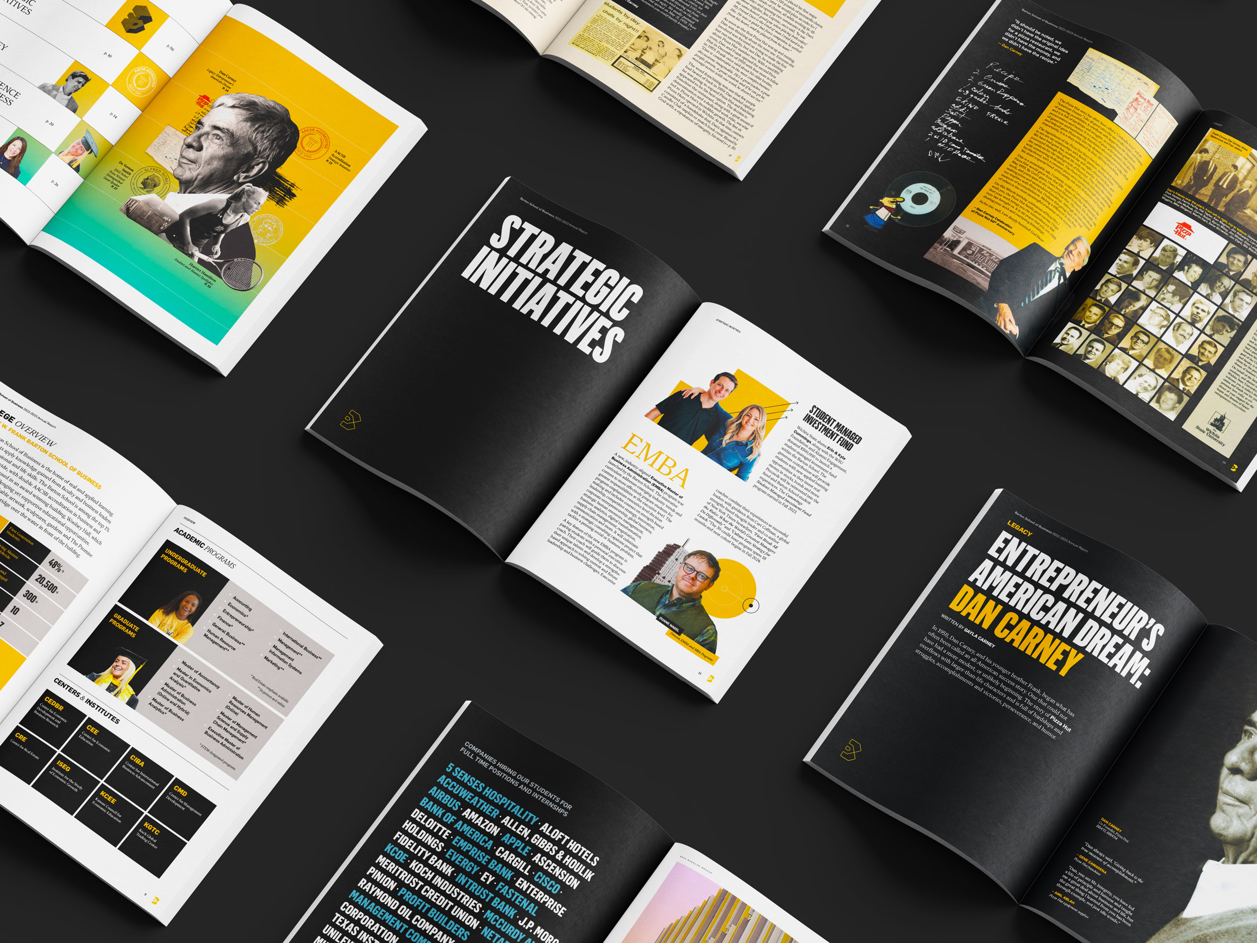
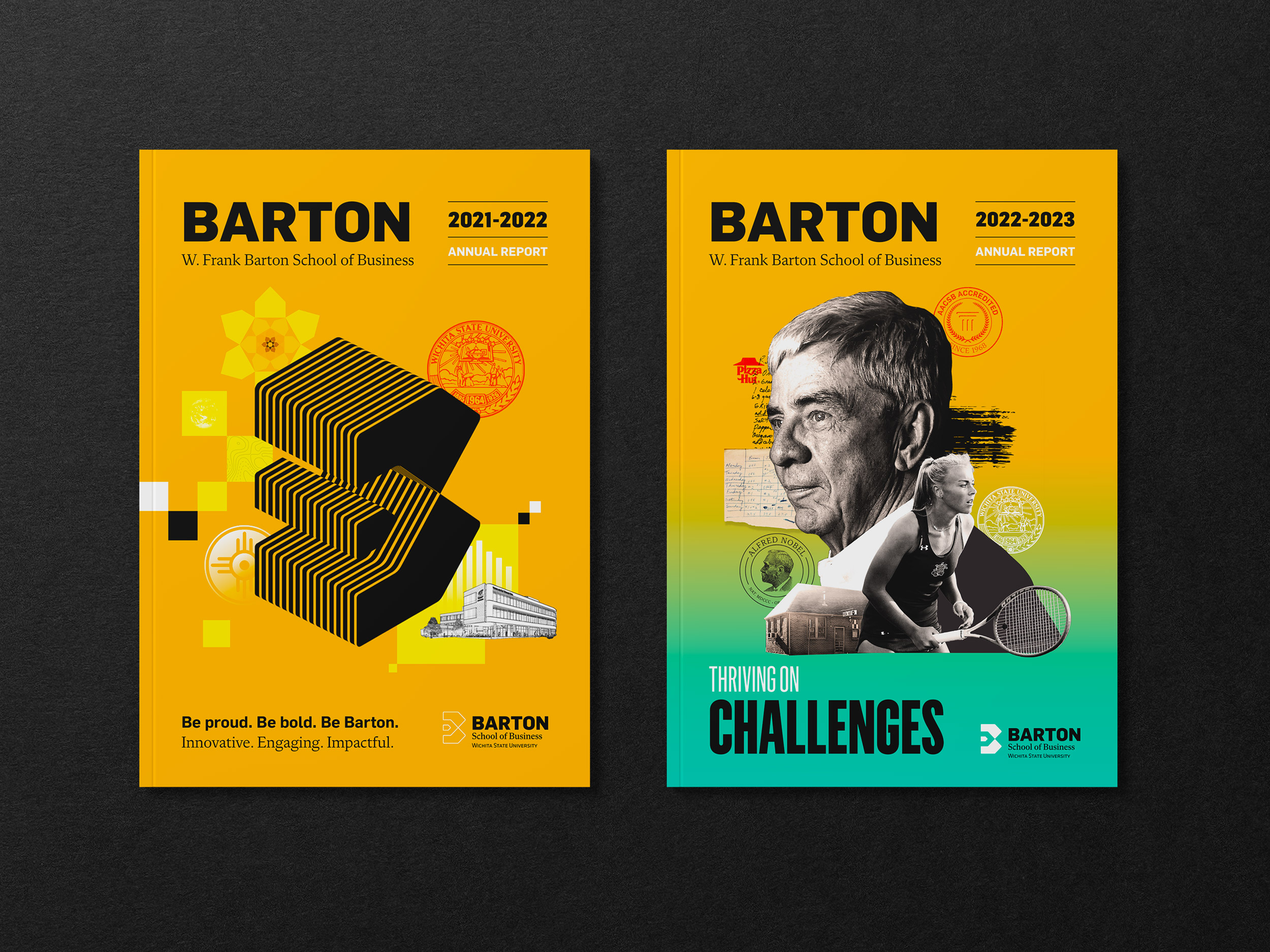
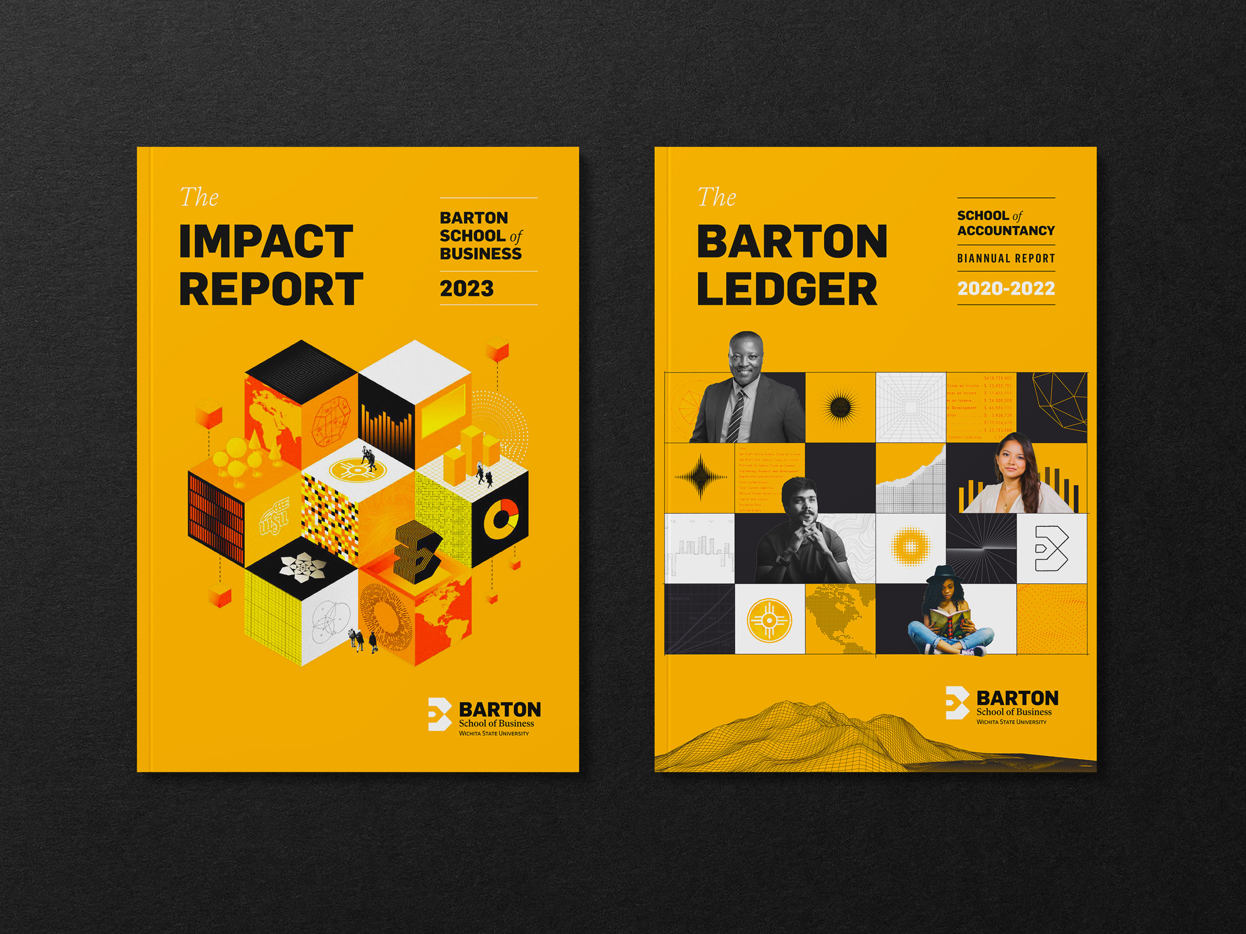
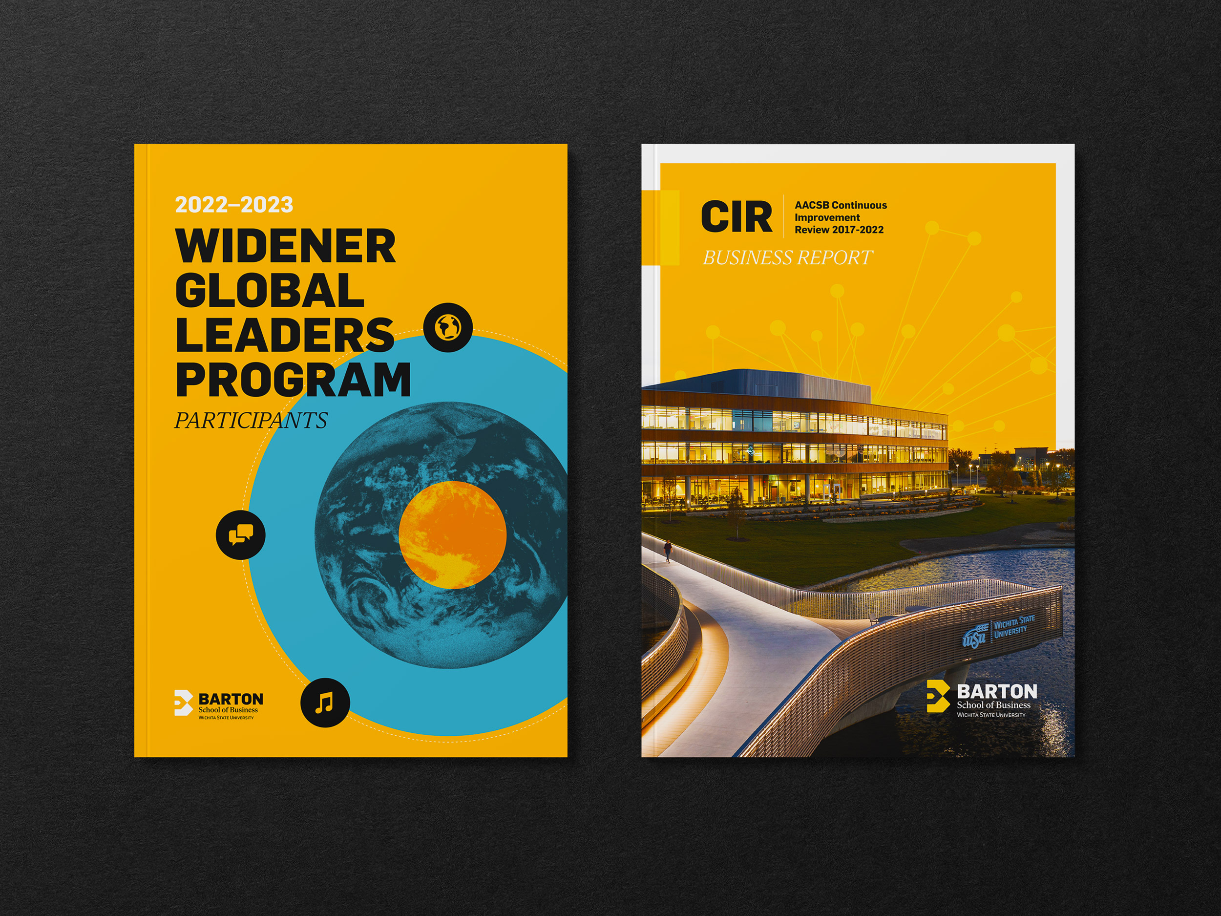
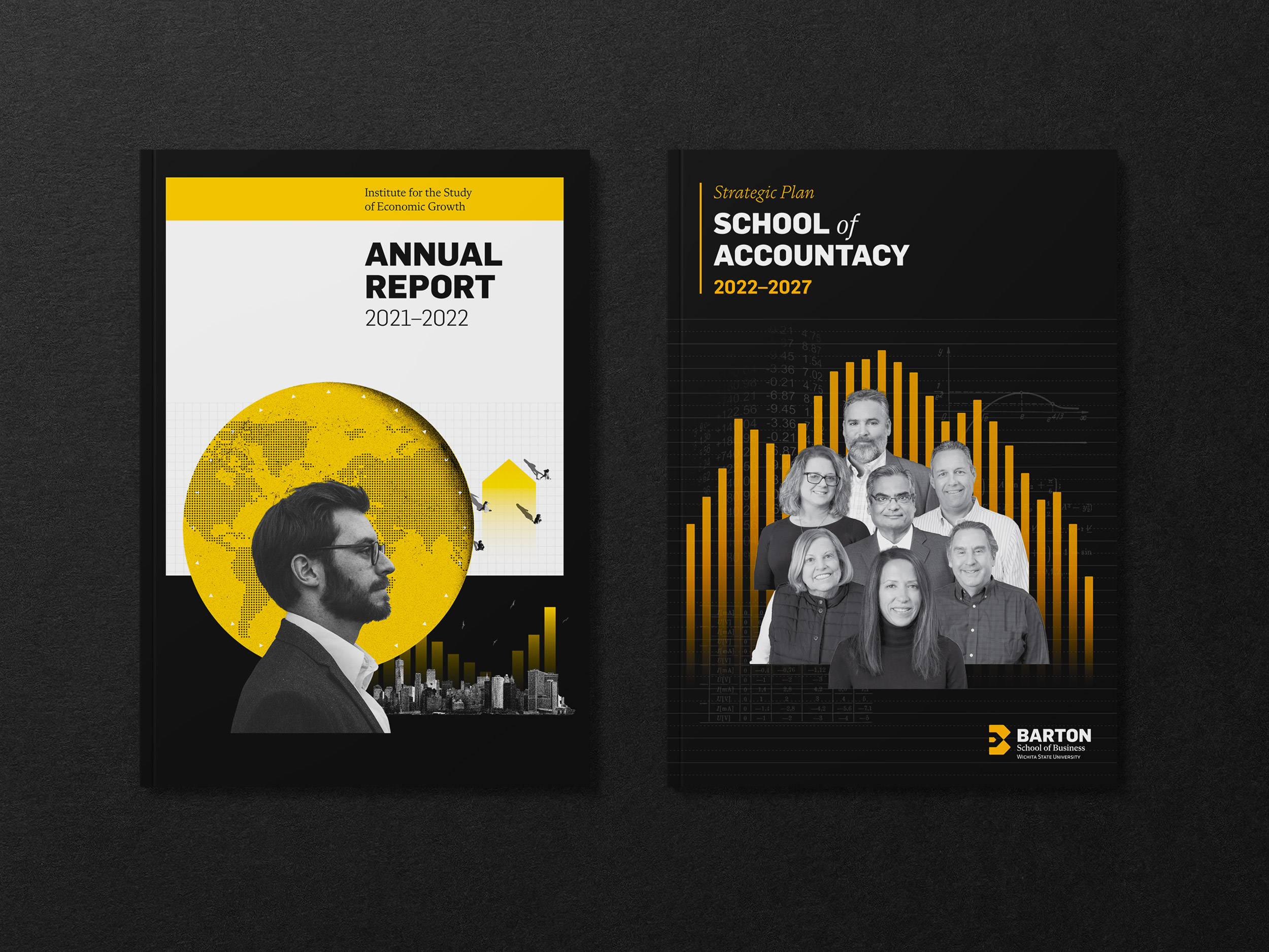
Editorial Design
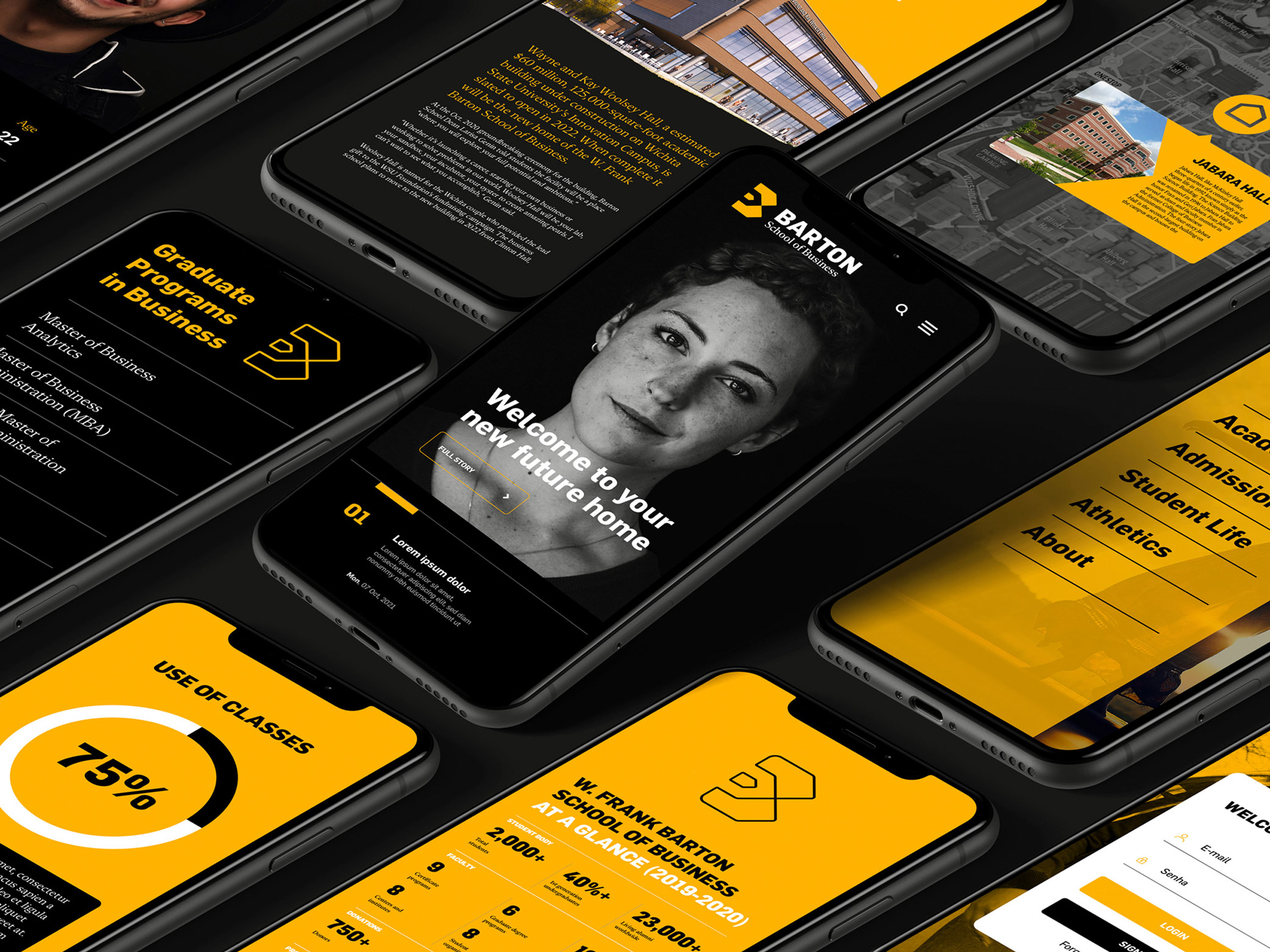
Webdesign
An arena that challenges students, faculty, staff, and other stakeholders to surpass expectations.
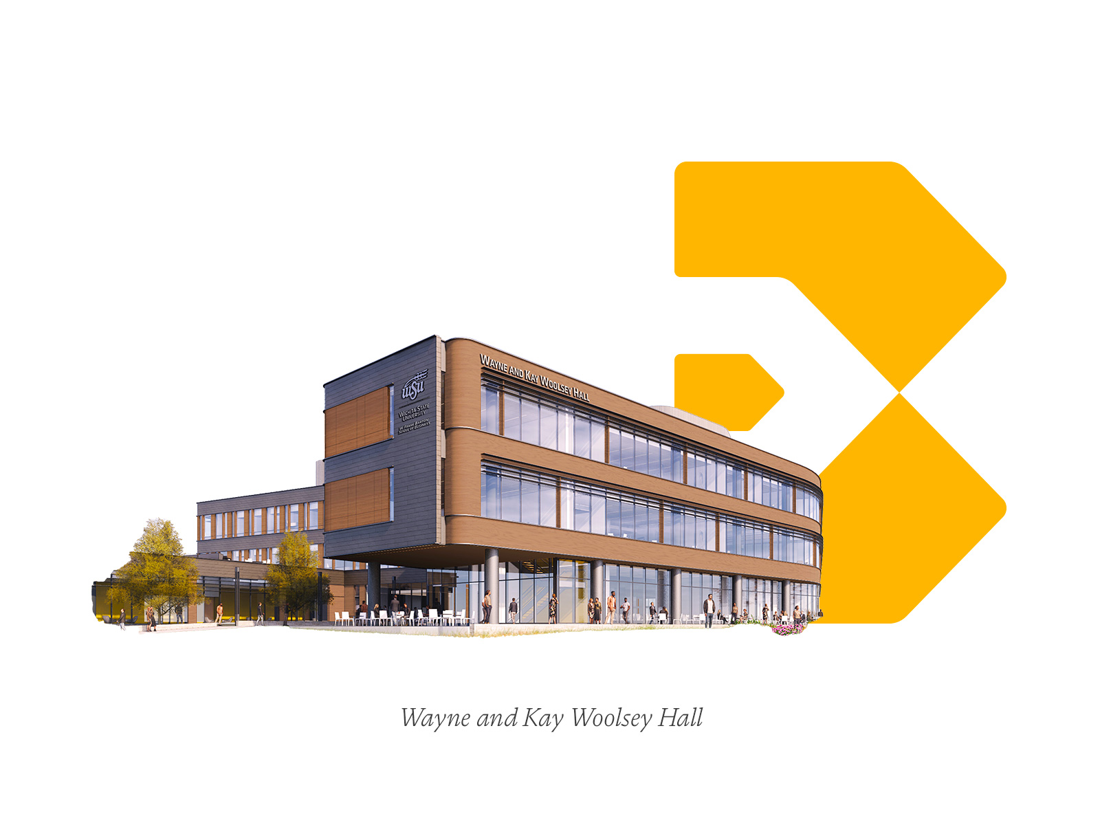
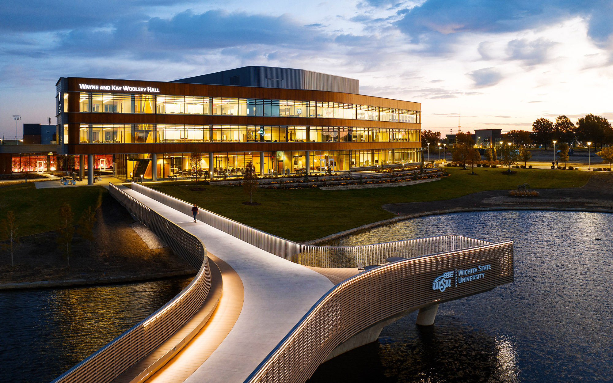
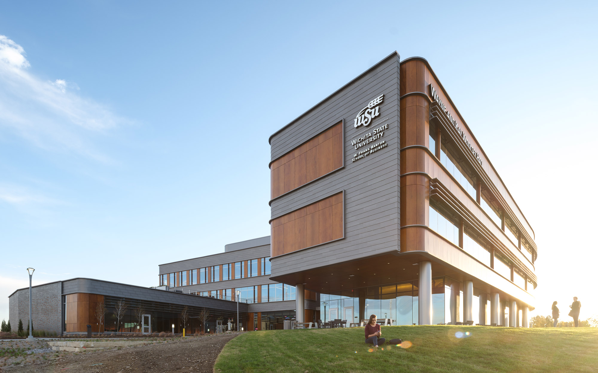
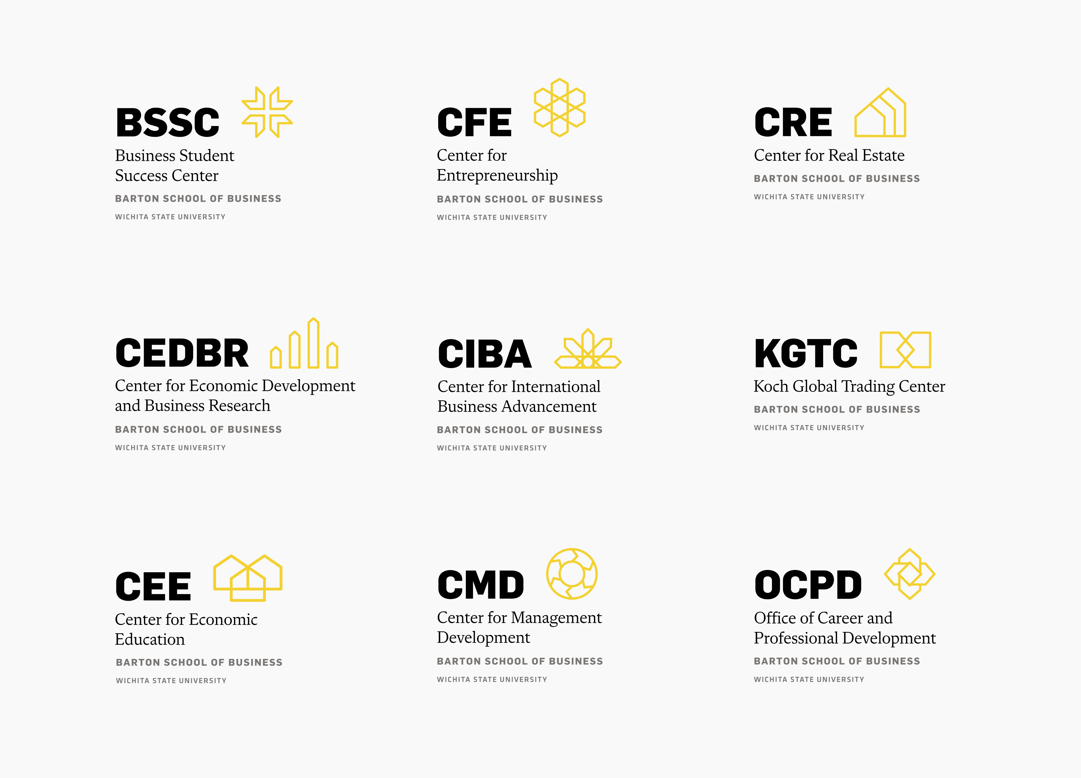
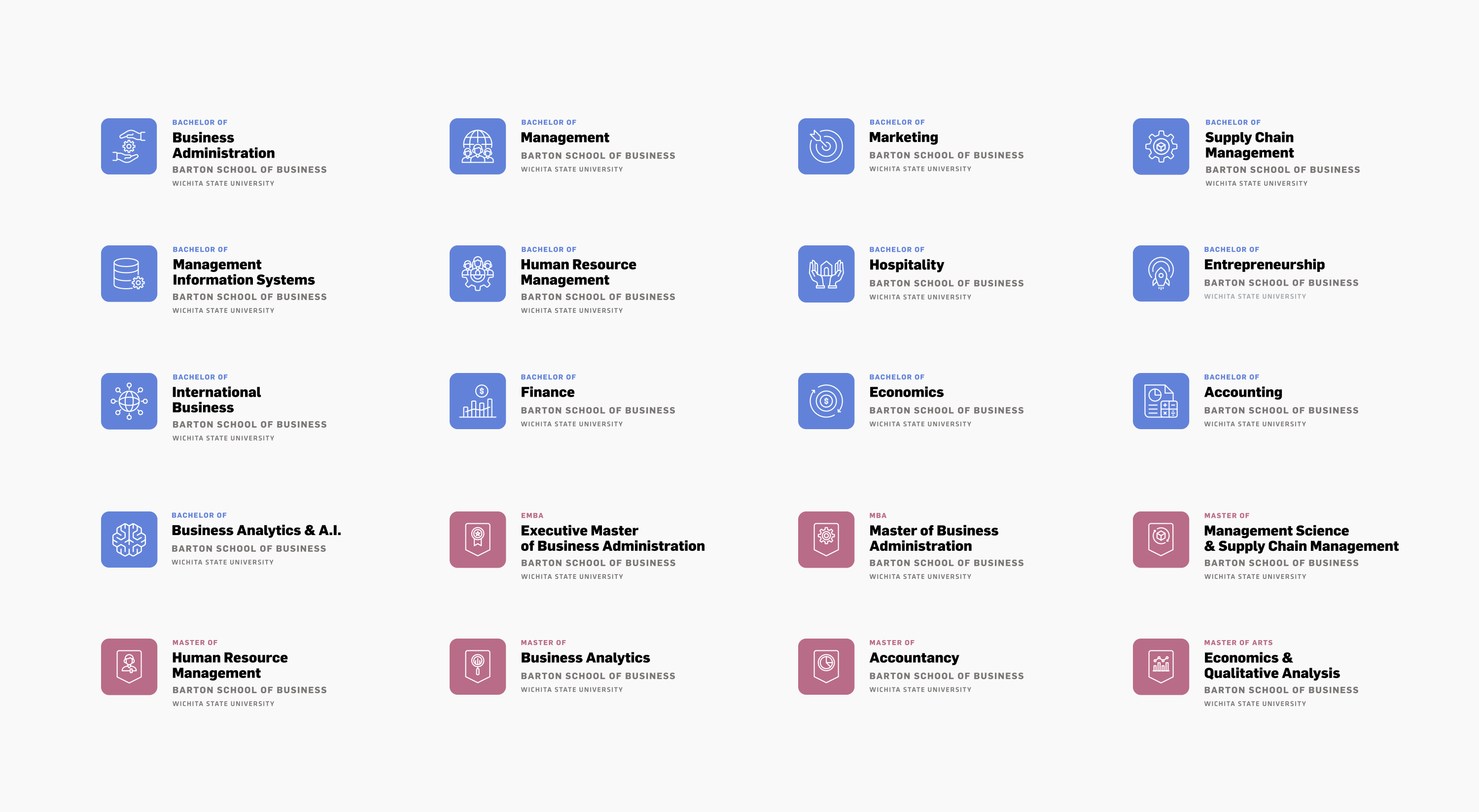
The W. Frank Barton School of Business is the home of real and applied learning. A place where students apply knowledge gained from faculty and business leaders while developing professional and life skills. The Barton School is among the top 1% of business schools worldwide, with double AACSB accreditation in business and accounting. The school is housed in a newly constructed, state-of-the-art building, Woolsey Hall, which serves as a cornerstone for challenging yet supportive educational opportunities for more than 2,300 students, offering 8 centers and institutes, 8 certificate programs, 10 undergraduate majors, and 7 graduate degree programs.
Barton's strategy team, led by Eric C. Mota and Dr. Larisa Genin (Dean) has defined a new positioning for the school and commissioned us to bring to light a bold, engaging, and timeless new brand identity & messaging framework. Due to the relevance and complexity of the project, the 18-month development process deep-dived into the education market and audience characteristics, with a large number of interviews with scholars, academics, partners, students, and the Wichita community. Its collaborative approach was determinant to bring confidence and will to embrace and expand the new branding system.
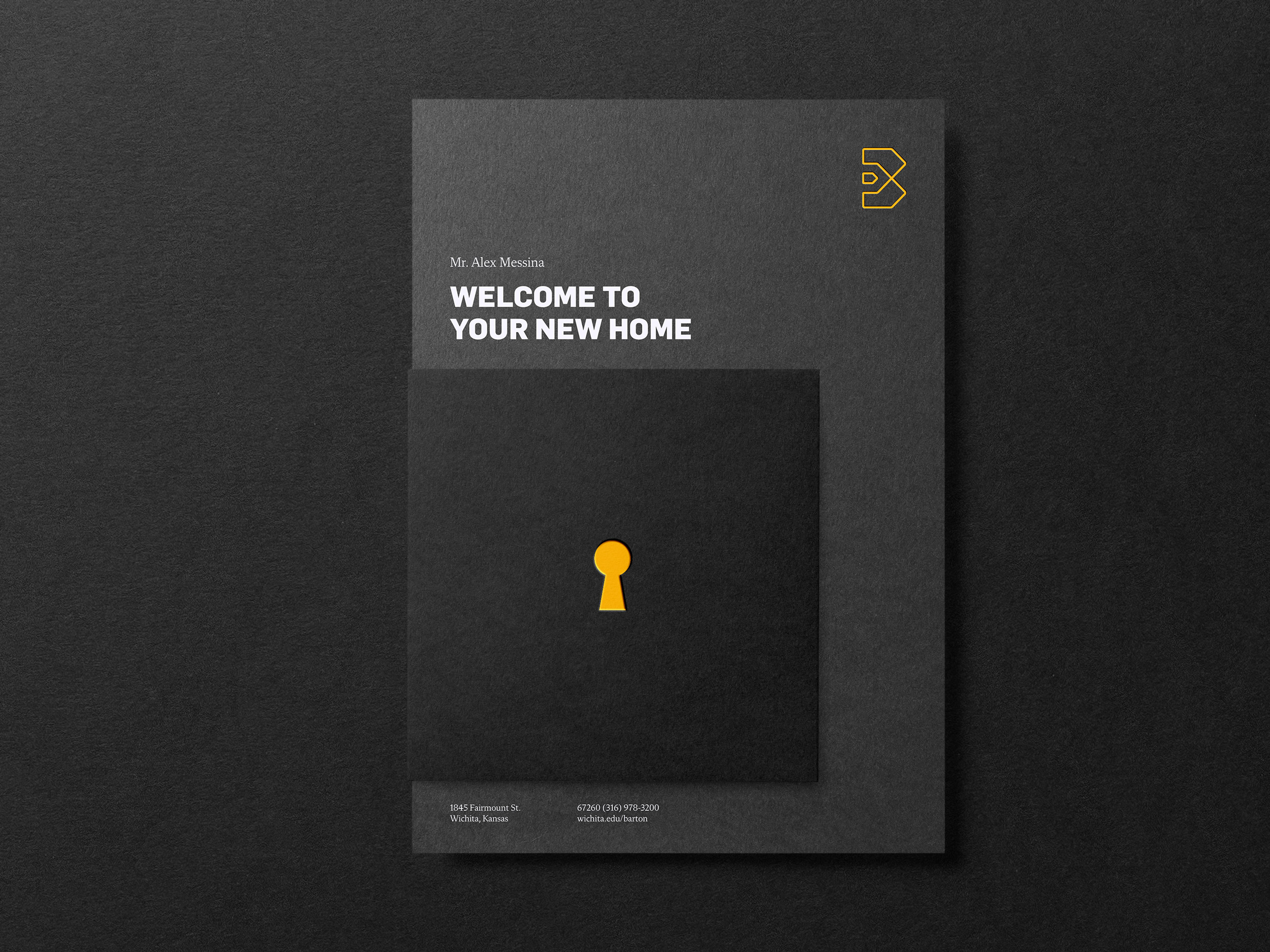
Be Bold. Be Barton.
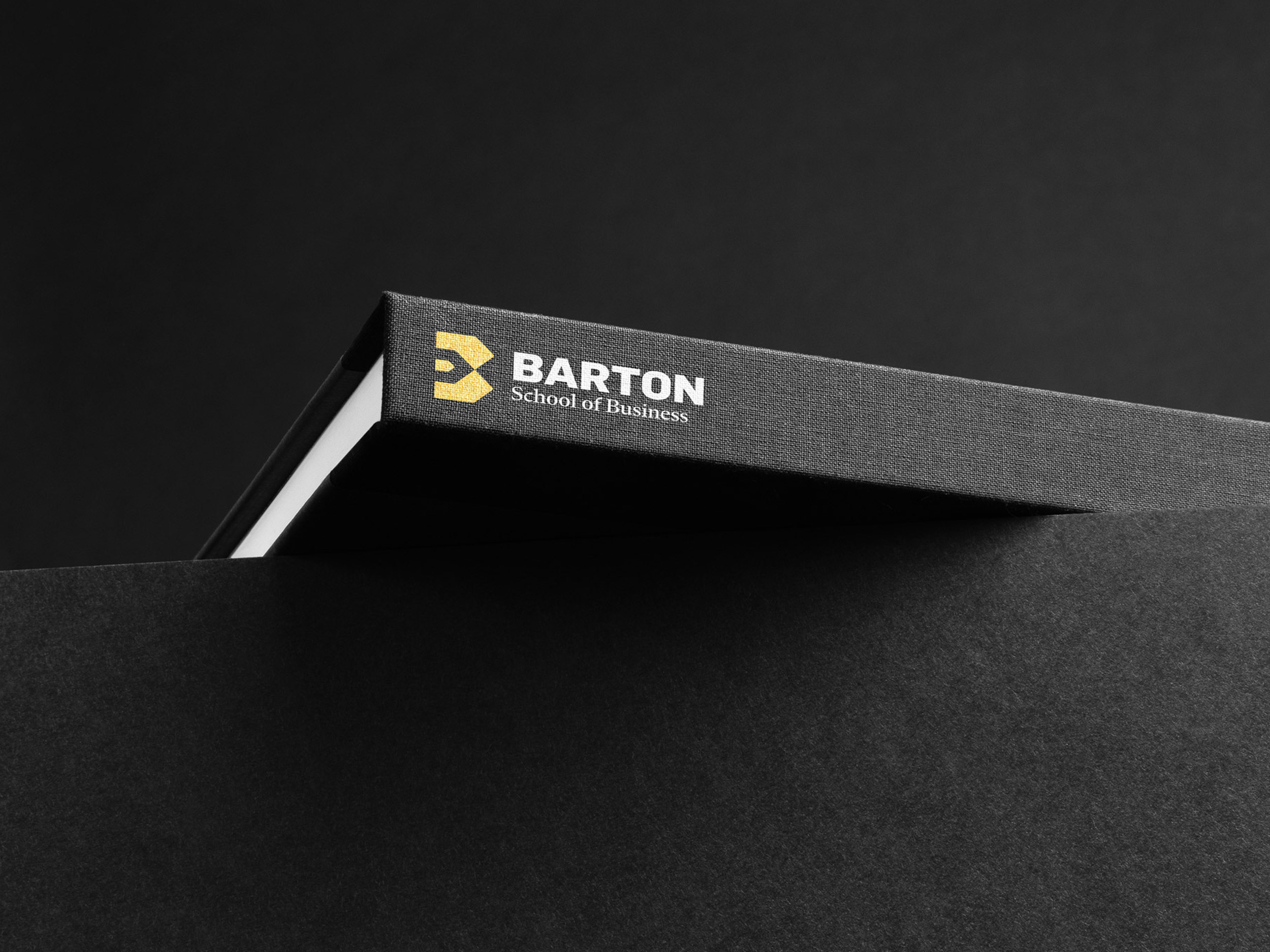
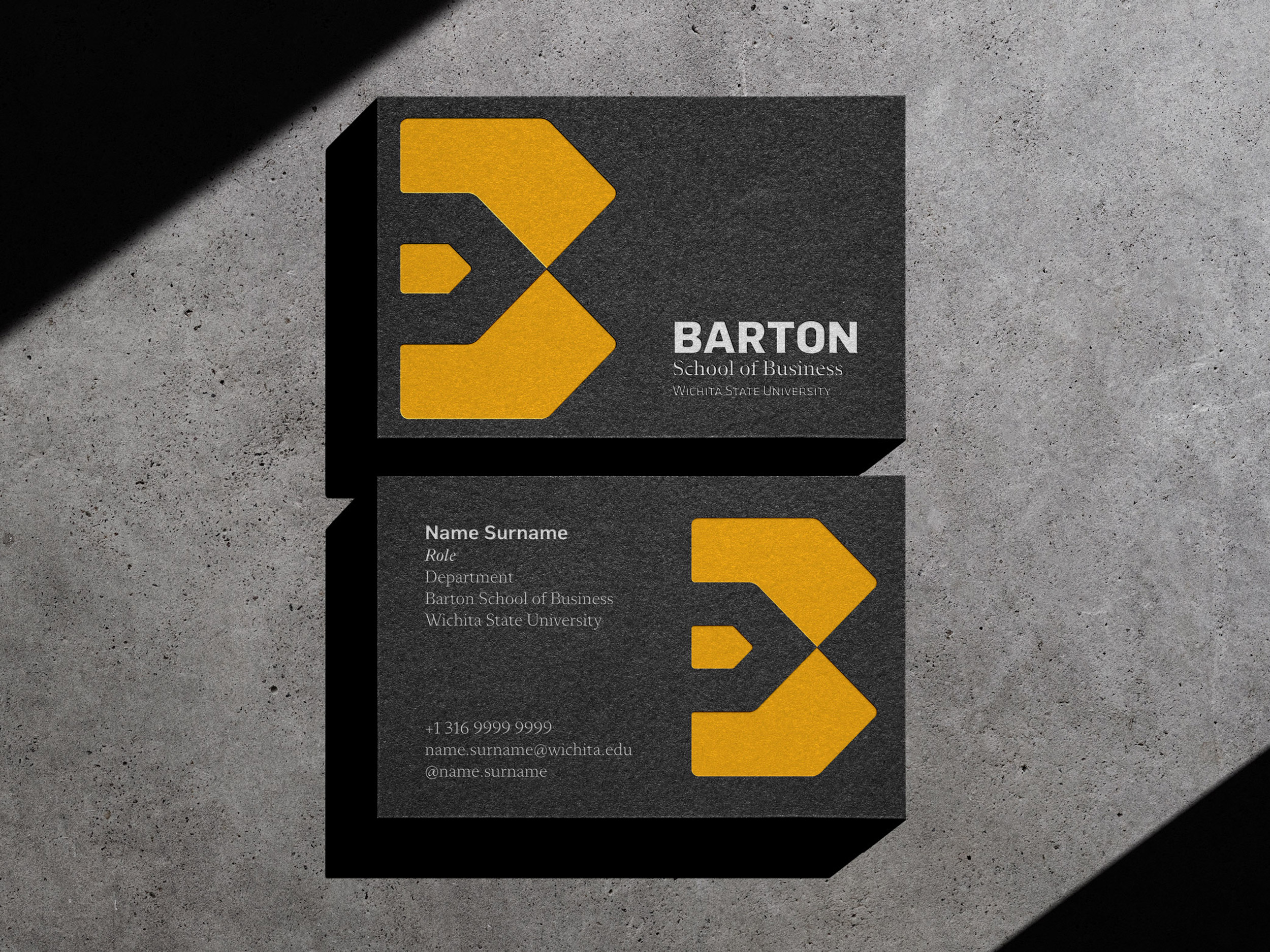
B monogram encapsulates the idea of a home for students willing to strive for the world with impact and determination. A challenging yet supportive environment for those who aspire to grow and develop themselves.
The symbol puts in evidence the B letter (Barton), shaped by the intersection of two houses: our own familiar house (internal) and the world (external). The arrow-shaped icon represents action, meaning, and purpose, evoking both the emotional dimension and the inherent pragmatism in the school. This duality is reinforced by the mix of sans (contemporary) and serif (traditional) typography in the logo design.


Branding, Creative Direction: Fabio Issao
Photography: Jason O'Rear, Gensler, WSU
Year: 2020 — present
© 2024 Fabio Issao. 山本功
