
Client
TodaVida
Services
Branding
Packaging
Illustration
Food to Forest.
TodaVida is a Brazilian-German regenerative food company, where each product finances a project in which the plant that supplies the raw material for the product is planted with other native trees in vacant lots to form a new forest, or rather, an agroforest. In it, there is a natural balance of biomass, nutrients, water, microorganisms, light, and shade. In addition, the forest stores CO2 regenerates the soil, and provides a new habitat for native animals. Through the forest, local communities can generate sustainable income, promoting the preservation of species.
The challenge of creating a visual concept for the TodaVida product line included important premises for the business, such as valuing the origin of the ingredients, the local culture and the producing communities, and the company's purpose of creating a sustainable economic system that harmonizes all links of production, distribution chain, commercialization, and consumption, promoting the restoration of Brazilian biomes.
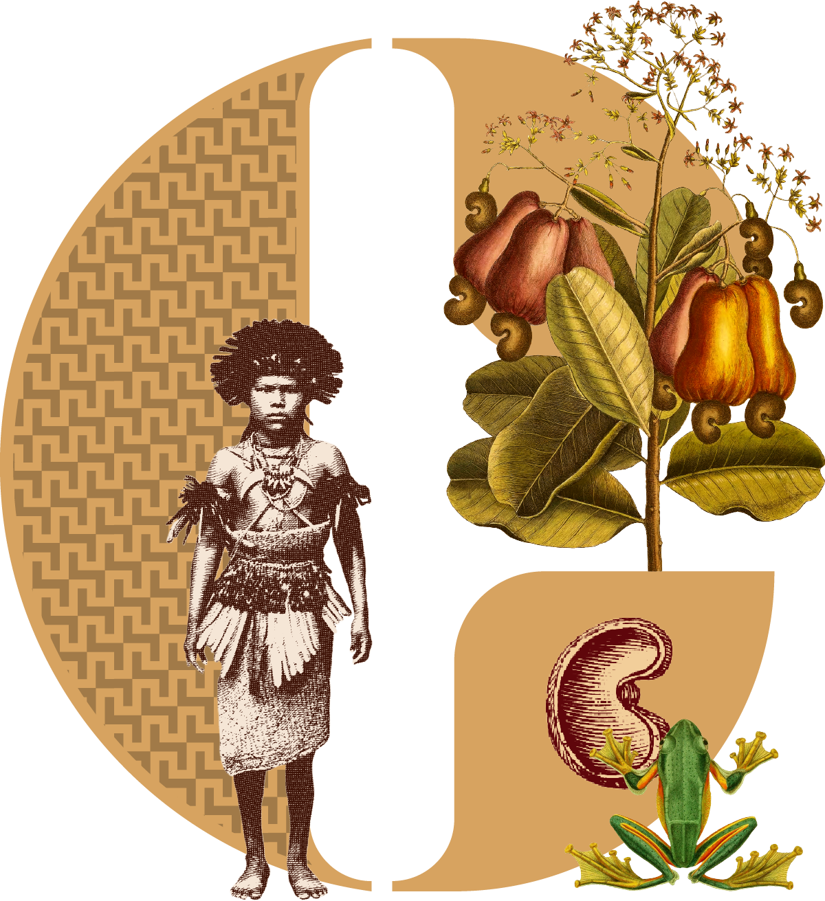
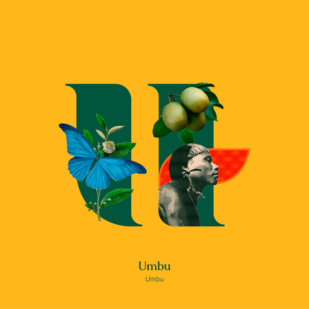
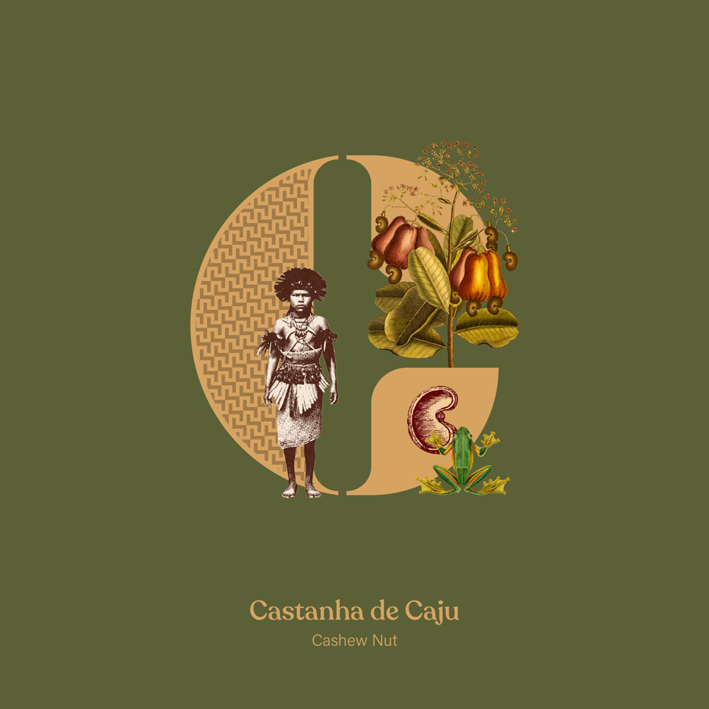
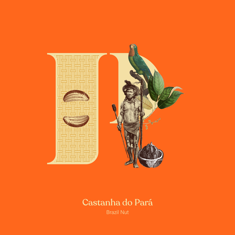
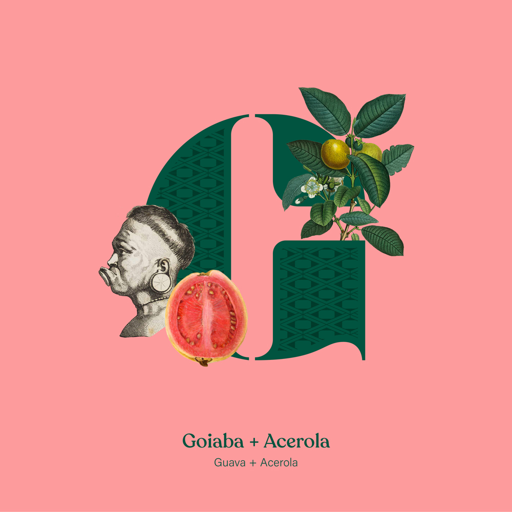
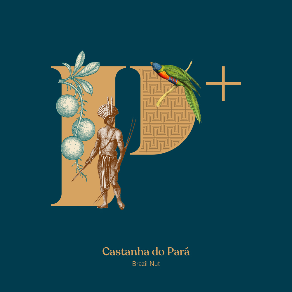
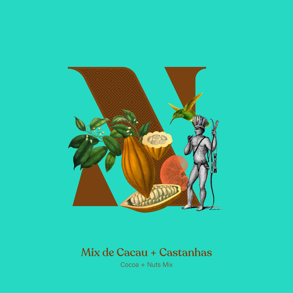
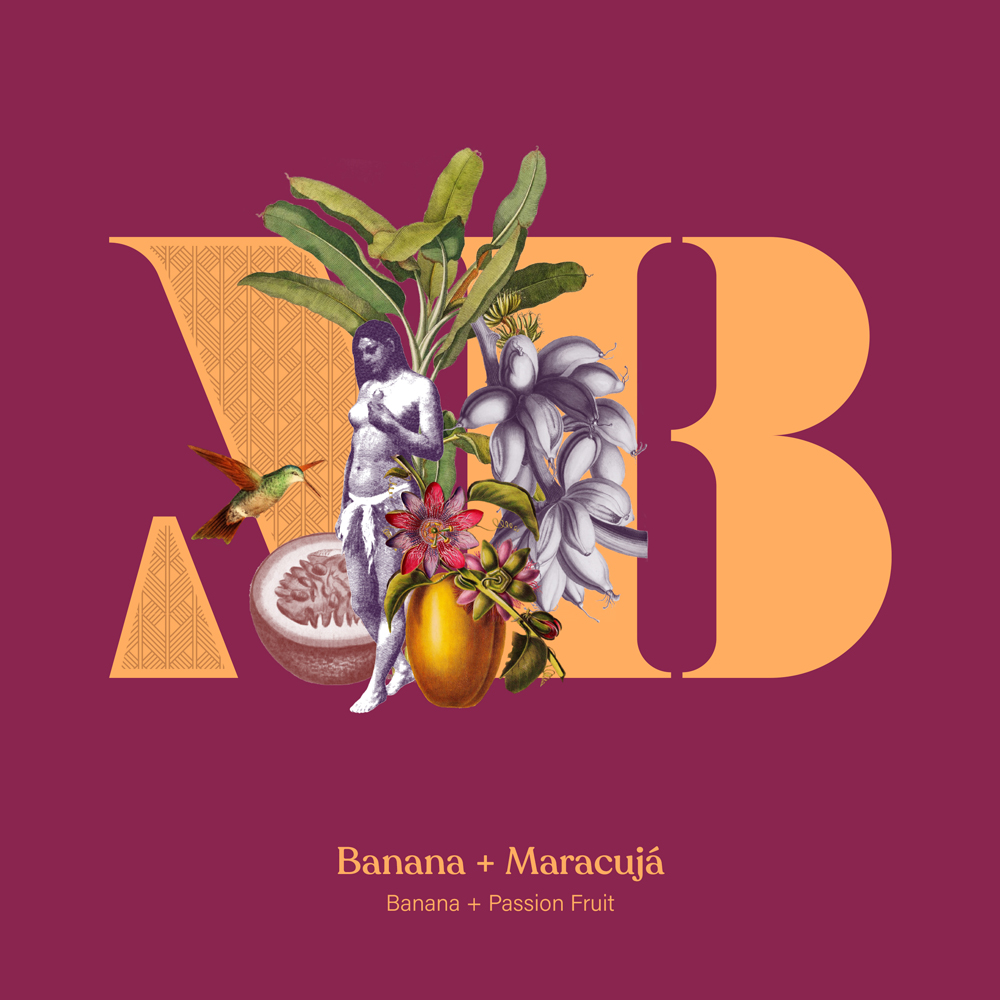
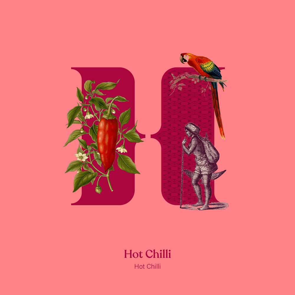
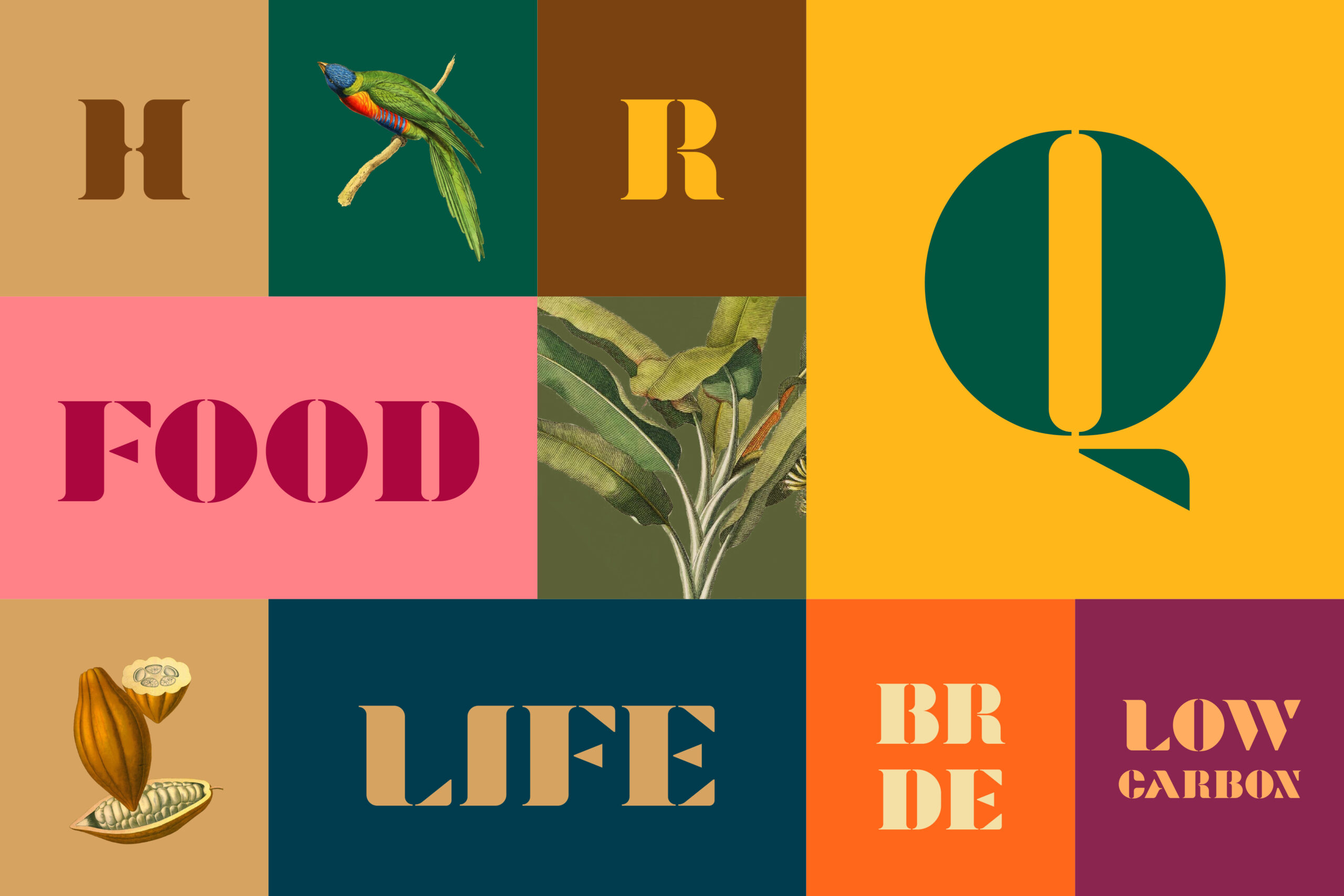
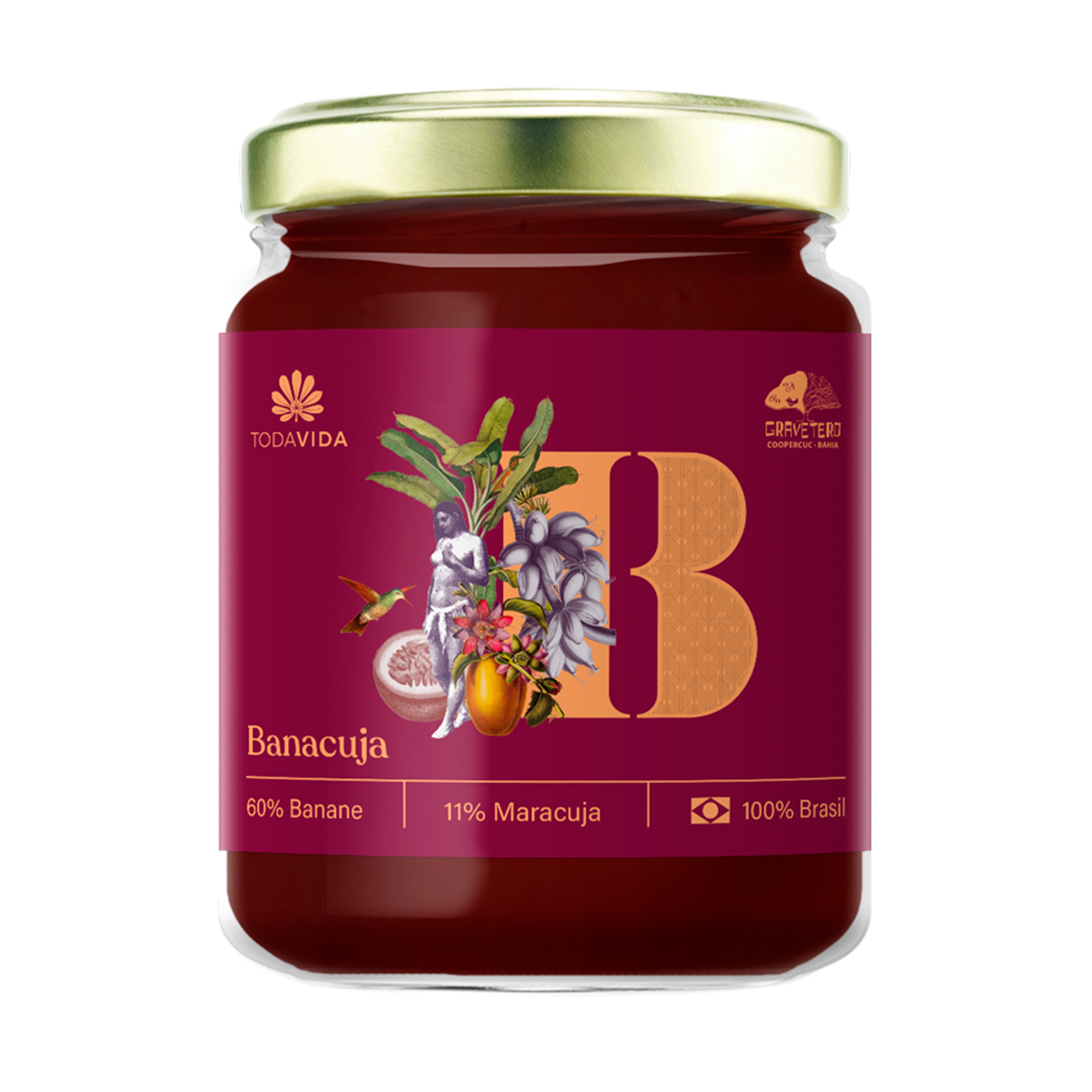
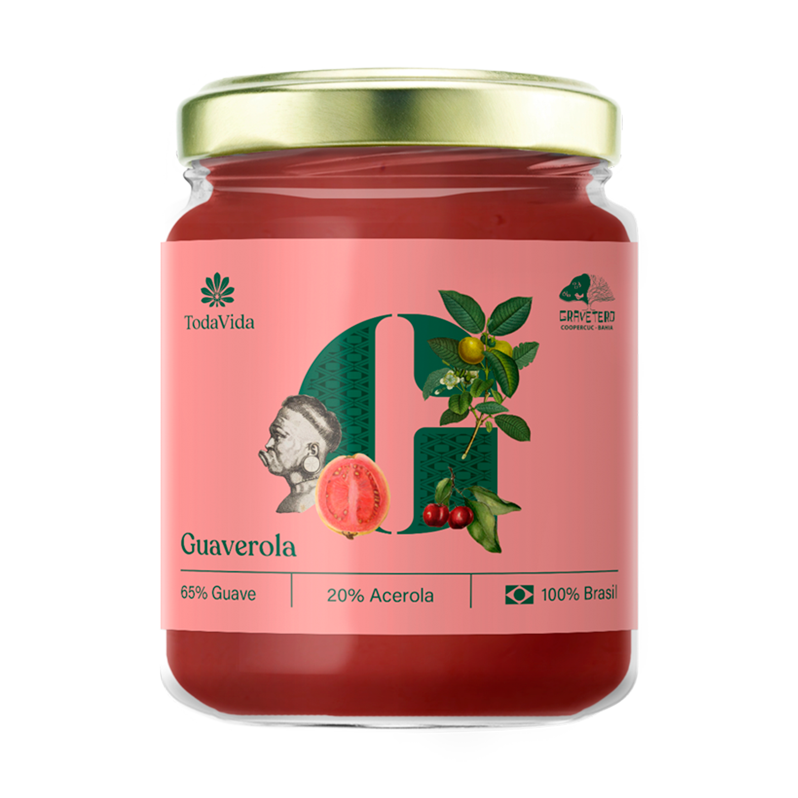
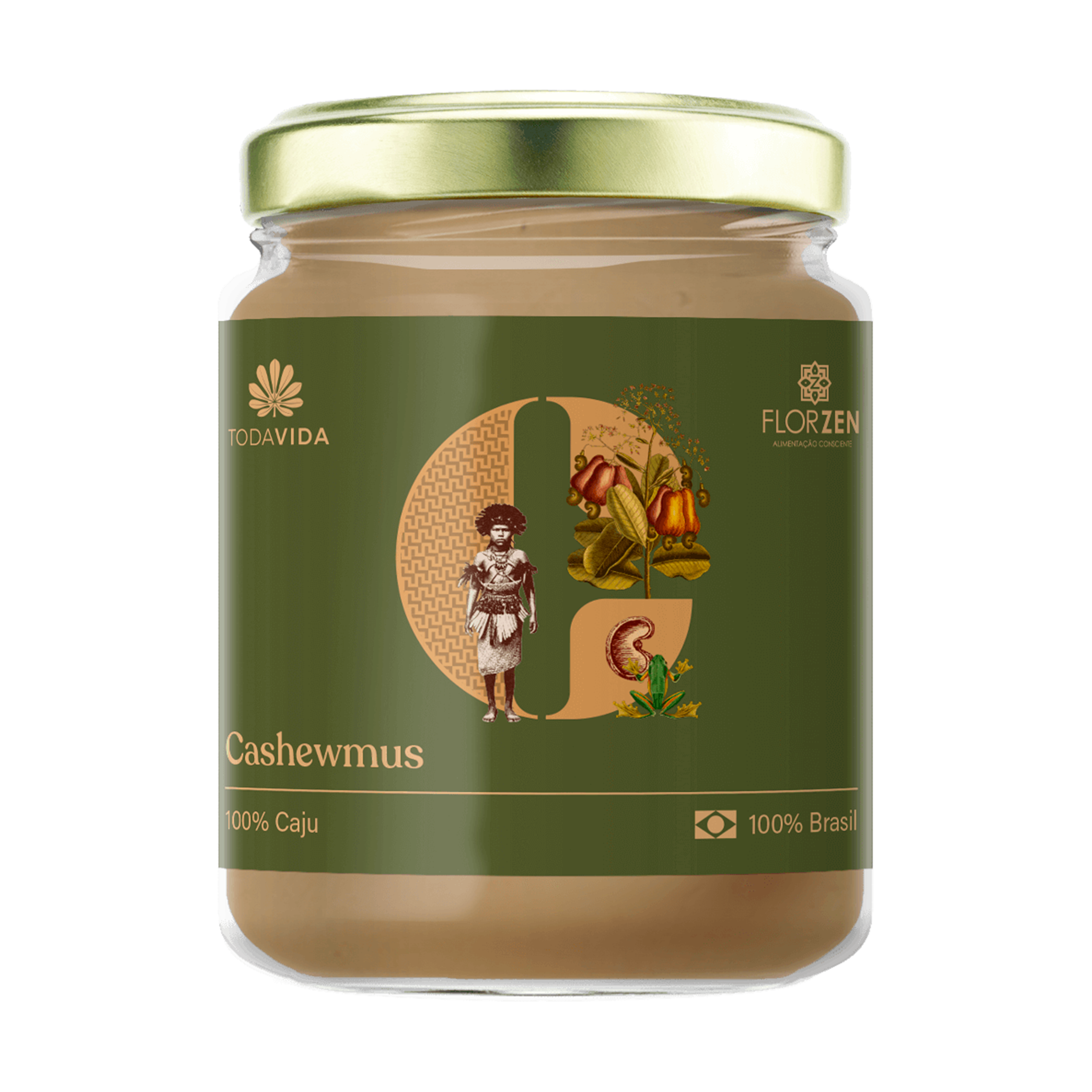
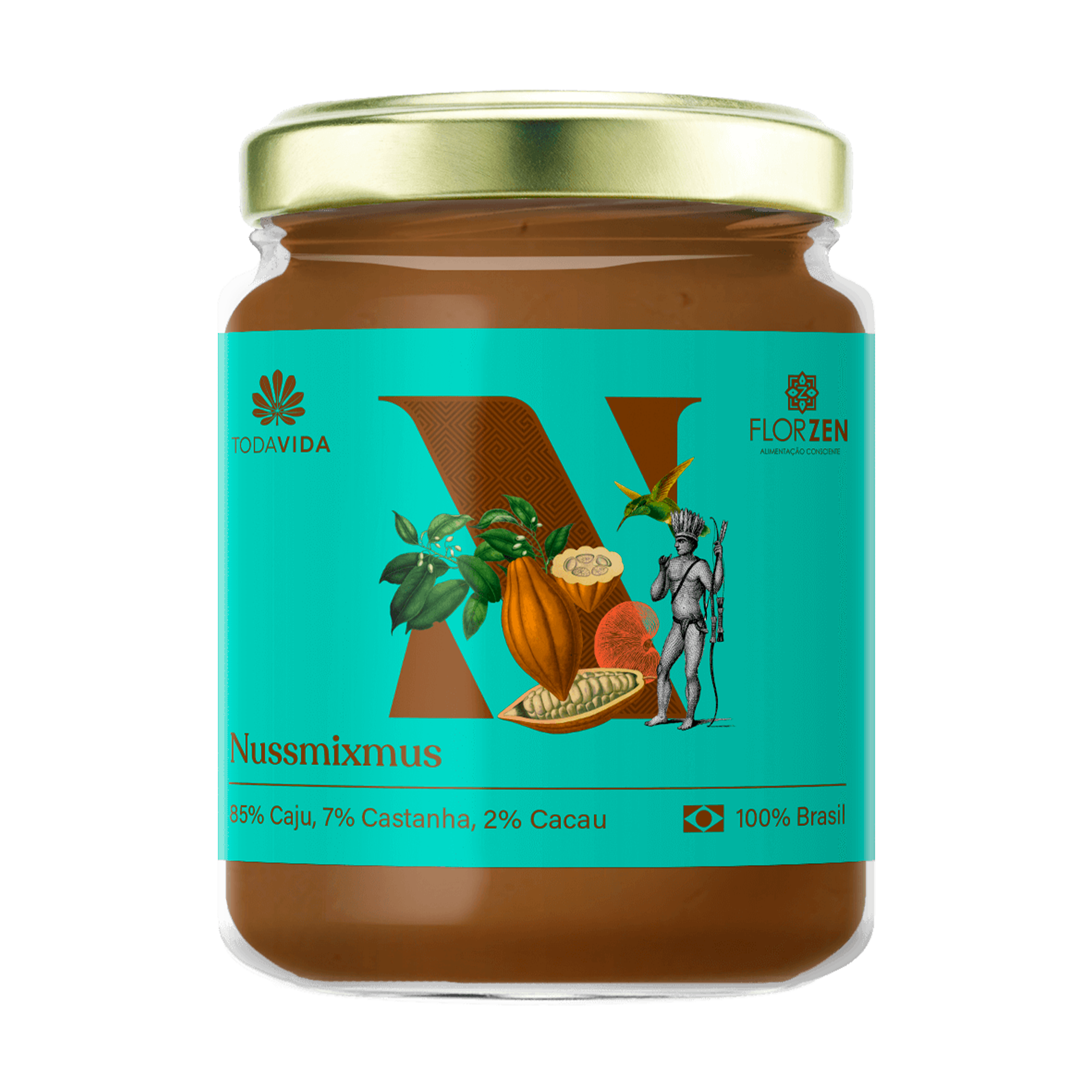
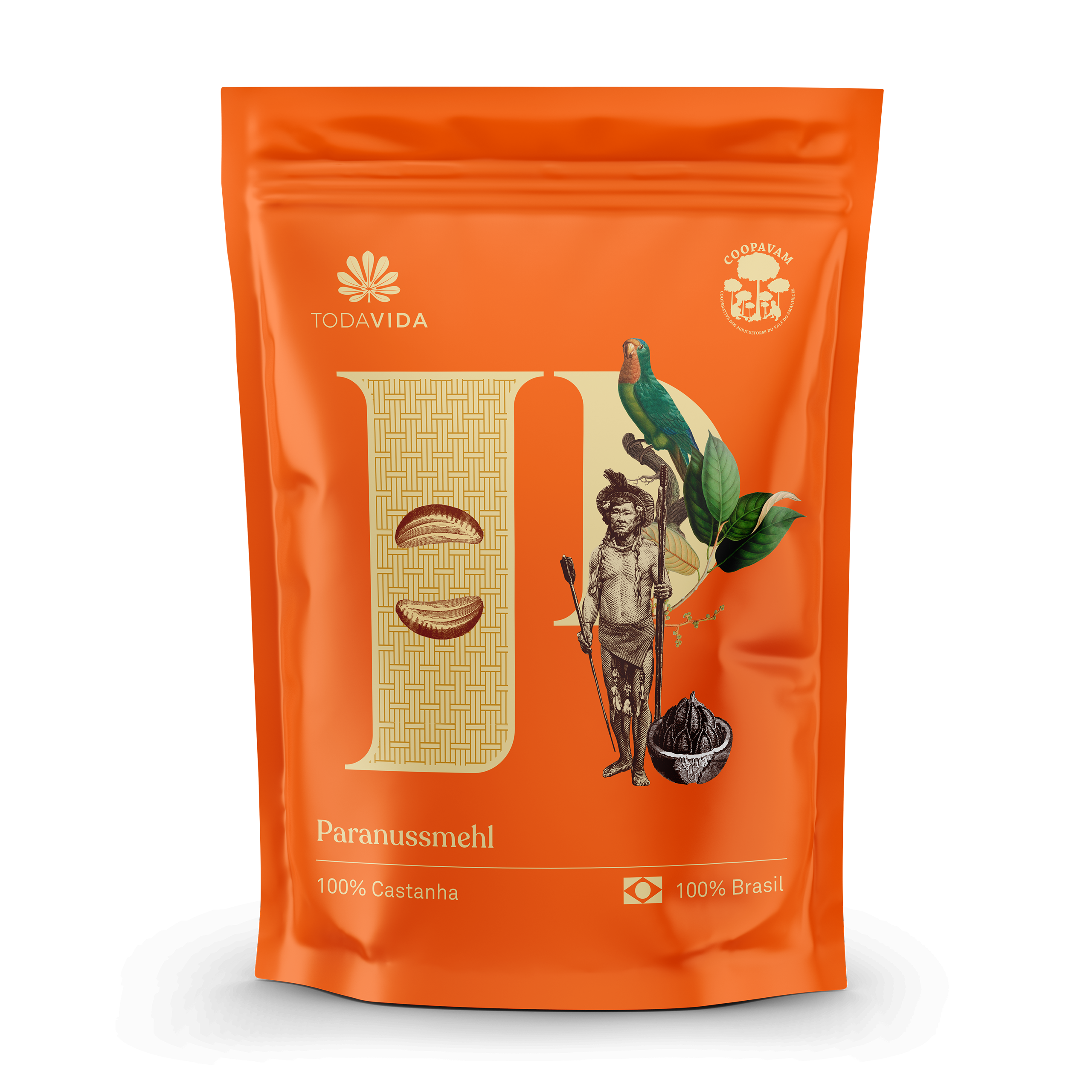
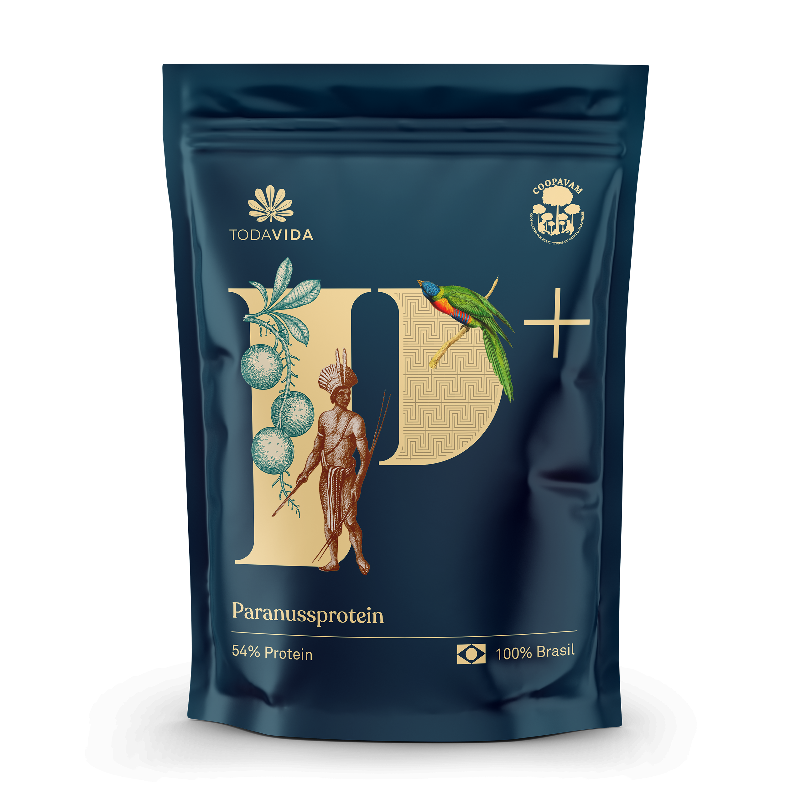
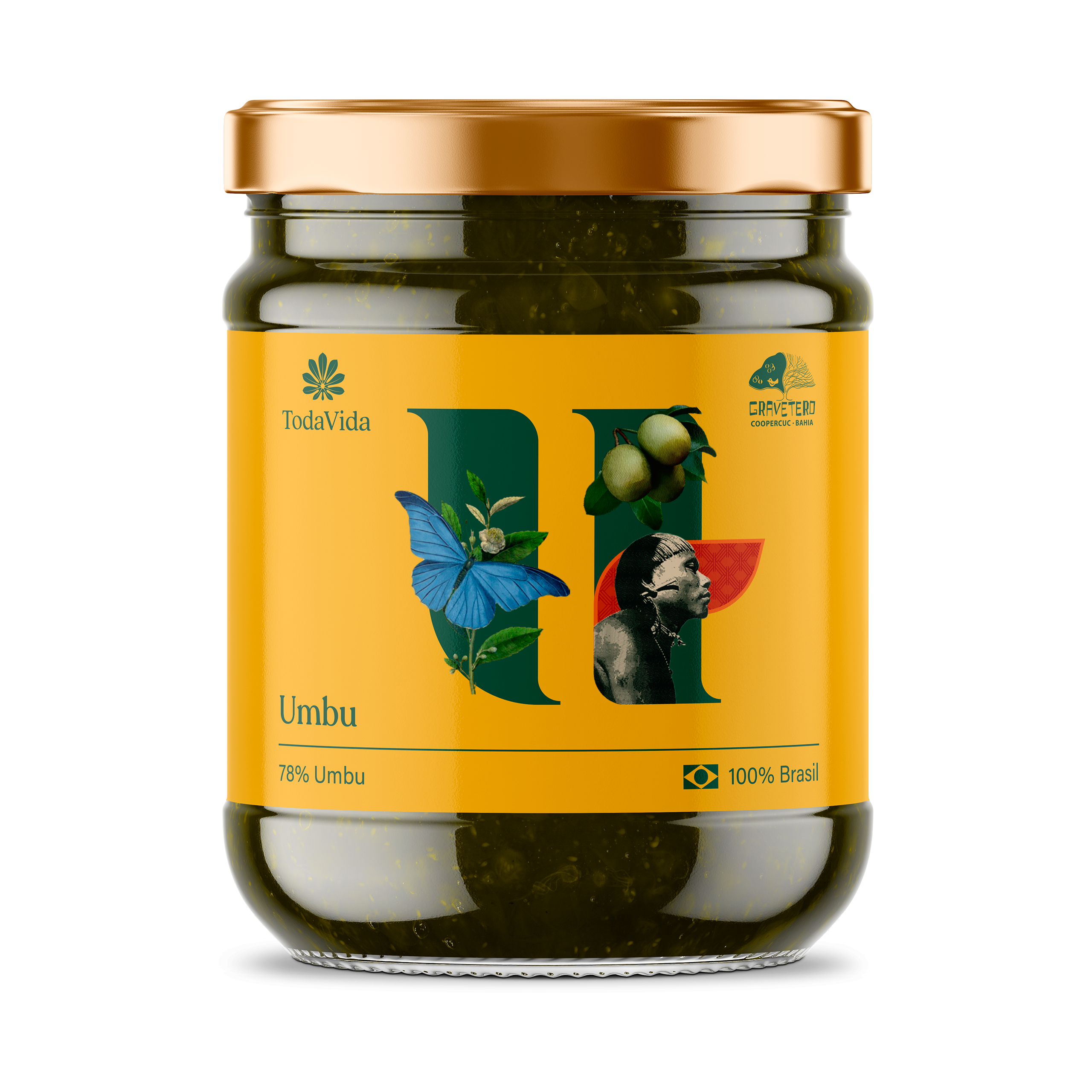
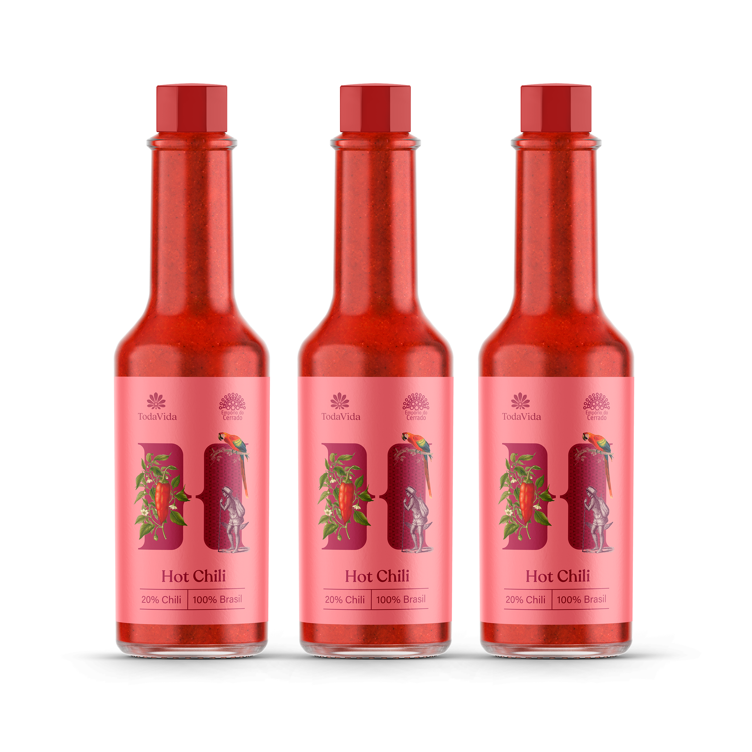
Collages were chosen as the key language for the packaging, combining three pillars: showing ingredients alongside people who represent the local culture, including positive iconic elements associated with the country, such as indigenous culture and forests, and, finally, repositioning products with a global visual language, preserving the distinctions of local identity.
The first layer of the labels is formed by the background colors, which reflect Brazilian diversity and tropicality, with the application of stencils designed especially for the project with the initial letter of each product (in Portuguese). The objective was to create a quick identification system for each product, based on a few elements. In the second layer, information is added, and arranged in a minimalist and rational layout, as well as the chosen typography. Finally, the iconographic elements that interact with the background letter are introduced, translating the cultural diversity behind each product. The use of indigenous patterns, lithographs, and botanical illustrations reinforces Brazil's cultural and artistic roots, bringing history and credibility to the products.
To improve the legibility of the brand, more in line with the post-creation visual communication of the label line, we revisited the original logo through the sophistication of the icon's strokes, making it cleaner and more readable, while replacing the name brand for a more organic and classic typography, giving the brand a more defined personality within its sector.
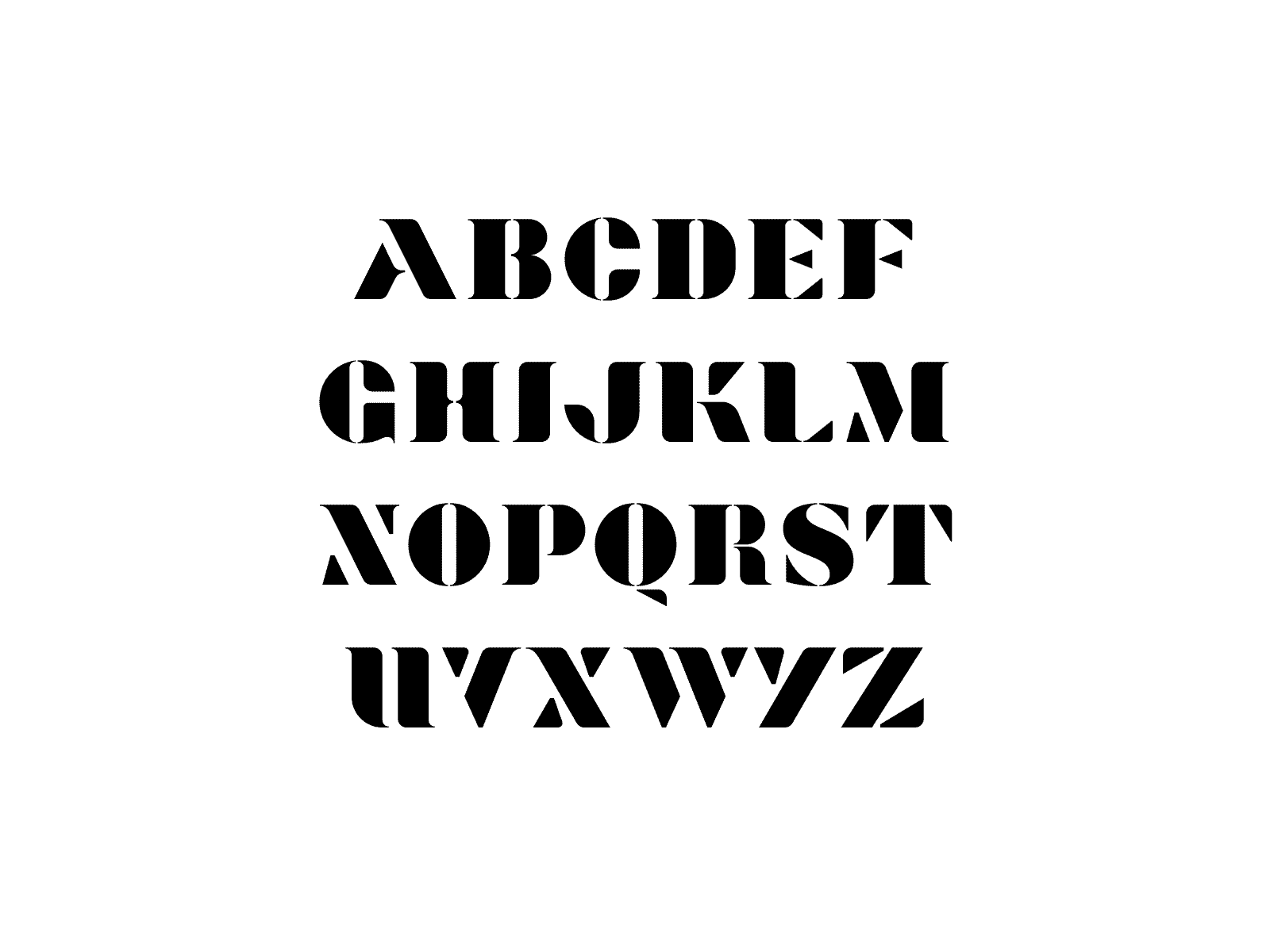
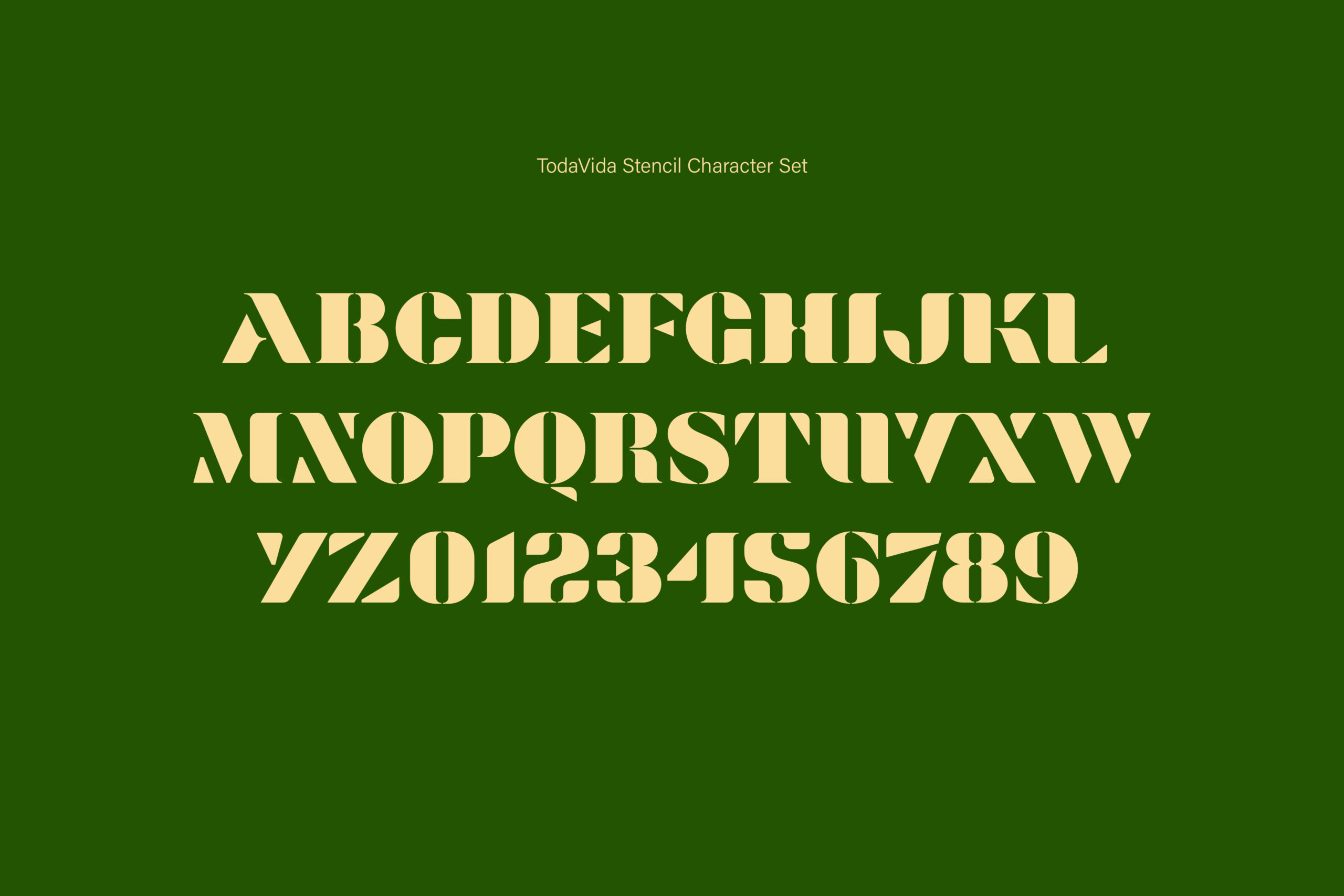
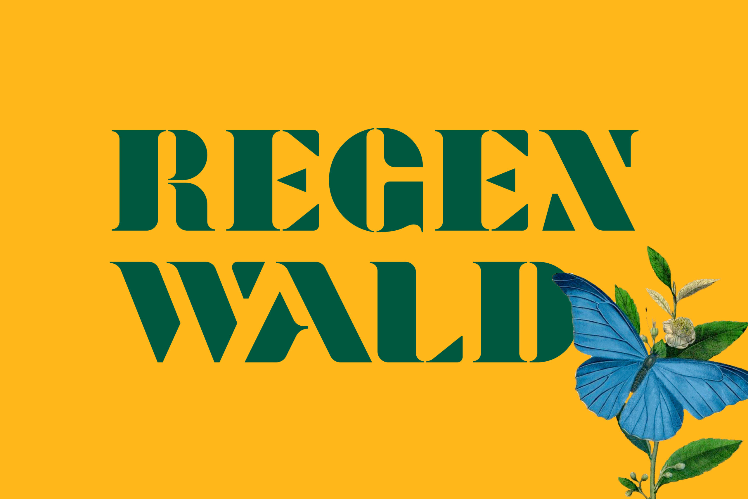
Custom typography
Bold display characters were designed based on the custom stencils of the labels, expanding the possibilities of typography used for TodaVida's communication. Characters were designed for displaying titles or numbers, occasionally used in visual pieces.
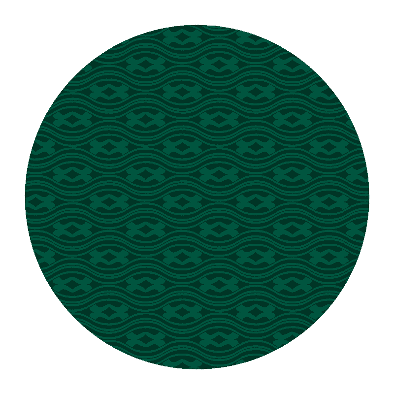
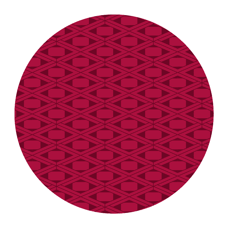
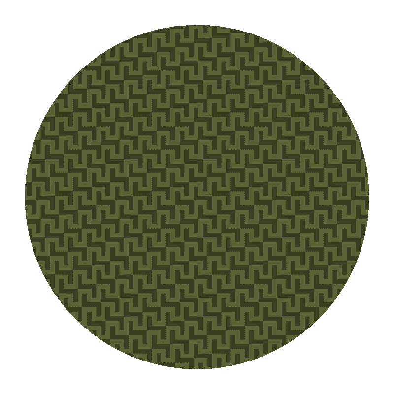
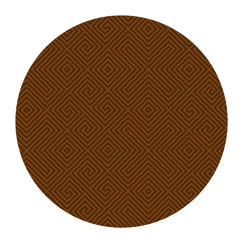
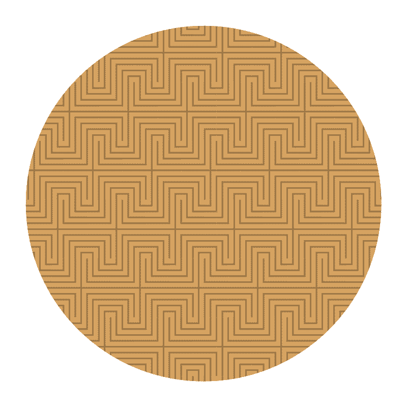
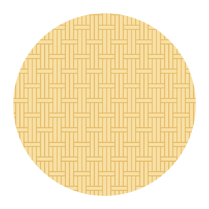
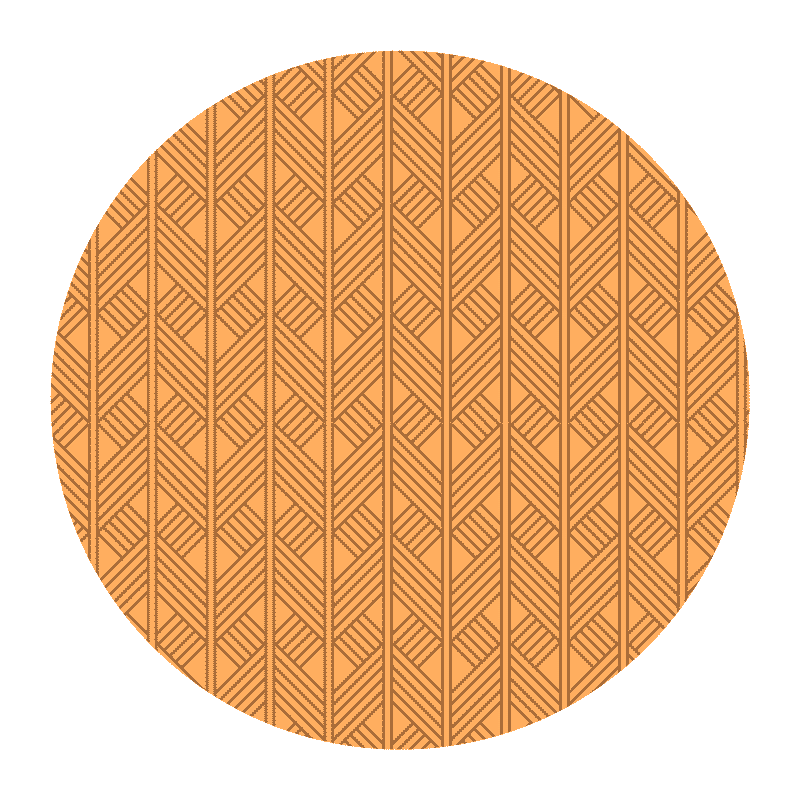
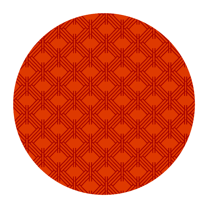
Indigenous patterns
A series of patterns in homage to the native peoples of Brazil was designed based on iconographic research on the culture of various indigenous tribes such as the Kayapós, the Guaranis, the Yanomamis, the Kaxinawás, the Pataxós, the Mundurukus, among others. The patterns reflect the relationship between the forest and its inhabitants, reinforcing their interdependence.
Creative direction: Fabio Issao
Branding, Illustrations: Fabio Issao
Iconography: Helena Nabuco
Year: 2019 — 2021
© 2024 Fabio Issao. 山本功
